Developer News
CSS Bar Charts Using Modern Functions
New CSS features can sometimes make it easier and more efficient to code designs we already knew how to create. This efficiency could stem from reduced code or hacks, or improved readability due to the new features.
In that spirit, let’s revamp what’s under the hood of a bar chart.
<ul class="chart" tabindex="0" role="list" aria-labelledby="chart-title"> <li class="chart-bar" data-value="32" tabindex="0" role="img" aria-label="32 percentage">32%</li> <!-- etc. --> </ul>We begin by laying out a grid.
.chart { display: grid; grid-template-rows: repeat(100, 1fr); /* etc. */ }The chart metric is based on percentage, as in “some number out of 100.” Let’s say we’re working with a grid containing 100 rows. That ought to stress test it, right?
Next, we add the bars to the grid with the grid-column and grid-row properties:
.chart-bar { grid-column: sibling-index(); grid-row: span attr(data-value number); /* etc. */ }Right off the bat, I want to note a couple of things. First is that sibling-index() function. It’s brand new and has incomplete browser support as of this writing (come on, Firefox!), though it’s currently supported in the latest Chrome and Safari (but not on iOS apparently). Second is that attr() function. We’ve had it for a while, but it was recently upgraded and now accepts data-attributes. So when we have one of those in our markup — like data-value="32" — that’s something the function can read.
With those in place, that’s really all we need to create a pretty darn nice bar chart in vanilla CSS! The following demo has fallbacks in place so that you can still see the final result in case your browser hasn’t adopted those new features:
CodePen Embed FallbackYes, that was easy to do, but it’s best to know exactly why it works. So, let’s break that down.
Automatically Establishing Grid ColumnsDeclaring the sibling-index() function on the grid-column property explicitly places the list items in consecutive columns. I say “explicit” because we’re telling the grid exactly where to place each item by its data-value attribute in the markup. It goes first <li> in first column, second <li> in second column, and so forth.
That’s the power of sibling-index() — the grid intelligently generates the order for us without having to do it manually through CSS variables.
/* First bar: sibling-index() = 1 */ grid-column: sibling-index(); /* ...results in: */ grid-column: 1; grid-column-start: 1; grid-column-end: auto; /* Second bar: sibling-index() = 2 */ grid-column: sibling-index(); /* ...results in: */ grid-column: 2; grid-column-start: 2; grid-column-end: auto; /* etc. */ Automatically Establishing Grid RowsIt’s pretty much the same thing! But in this case, each bar occupies a certain number of rows based on the percentage it represents. The grid gets those values from the data-value attribute in the markup, effectively telling the grid how tall each bar in the chart should be.
/* First bar: data-value="32" */ grid-row: span attr(data-value number); /* ...results in: */ grid-row: span 32 /* Second bar: data-value="46" */ grid-row: span attr(data-value number); /* ...results in: */ grid-row: span 46The attr() function, when provided with a data type parameter (the parameter value number in our case), casts the value retrieved by attr() into that specific type. In our example, the attr() function returns the value of data-value as a <number> type, which is then used to determine the number of rows to span for each bar.
Let’s Make Different Charts!Since we have the nuts and bolts down on this approach, I figured I’d push things a bit and demonstrate how we can apply the same techniques for all kinds of CSS-only charts.
For example, we can use grid-row values to adjust the vertical direction of the bars:
CodePen Embed FallbackOr we can skip bars altogether and use markers instead:
CodePen Embed Fallback CodePen Embed FallbackWe can also swap the columns and rows for horizontal bar charts:
CodePen Embed Fallback Wrapping upPretty exciting, right? Just look at all the ways we used to pull this stuff off before the days of sibling-index() and an upgraded attr():
- Making Charts with CSS (Robin Rendle, 2015)
- Making A Bar Chart with CSS Grid (Robin Rendle, 2017)
- More CSS Charts, with Grid & Custom Properties (Miriam Suzanne, 2017)
- Overlapping Bar Charts (Saleh Mubasher, 2022)
CSS Bar Charts Using Modern Functions originally published on CSS-Tricks, which is part of the DigitalOcean family. You should get the newsletter.
No Hassle Visual Code Theming: Publishing an Extension
Creating your theme is the fun part. After you’re done, the next step is to publish your theme so you — and others — can enjoy your creation!
You’d think that publishing a VS Code extension is an easy process, but it’s not. (Maybe I’m used to the ease of publishing npm packages and take registries for granted.)
Anyway, you have to publish your theme in two places:
- Visual Studio Marketplace for VS Code users
- Open VSX for other text editors
You might also want to publish to npm for others to use your theme easily for other contexts — like syntax highlighting via Shiki.
Preparing your themeWhen you name your theme, you cannot put it under a scope like @scope/theme-name. Doing so will prevent you from publishing to Open VSX.
So, make sure your theme name is unscoped. (The theme word is optional):
{ "name": "twilight-cosmos-theme", }To include an icon for your theme, you need a 128px square image file that can be accessible within your project. Put this under the icon property to point to the file:
{ "icon": "path/to/icon.png", }Next, you want to ensure that you have a contributes key in your package.json file. VS Code and other text editors search for this to find themes.
{ "contributes": { "themes": [ { "label": "<Theme Name>", "uiTheme": "vs-dark", "path": "./<path-to-theme>.json" } ] }, }Finally, you want to include several keywords to make your theme searchable on both VS Marketplace and Open VSX.
If you’re having problems with this, give AI your theme file and ask it to generate keywords for you 😉
{ "keywords": [ "theme", "dark theme", "twilight", "cosmos", "color-theme", "dark", "purple", "blue", "vscode-theme" ], } Publishing to Visual Studio MarketplaceMicrosoft lets you publish to Visual Studio Marketplace via vsce if you have a personal access token from an Azure DevOps account.
Unfortunately, while creating this article, I encountered several problems setting up my Azure Devops account so I had to publish my extension via the manual route.
I’ll talk about both routes here.
Before publishing, you need to have a Visual Studio Marketplace account. So, sign up for one if you don’t have it yet.
Then do the following:
- Click on Publish Extension.
- Create a publisher account.
This step is needed for publishing both via vsce and the manual route.
Publishing via VSCEFor this to work, you need a Azure DevOps account. When you have that, you can create a Personal Access Token with these steps.
Note: It’s kinda irritating that you can’t have an lifetime access token with Azure DevOps. The maximum expiry is about one year later.
Also note: I had immense trouble creating my Azure DevOps account when I tried this — the back end kept hanging and I couldn’t find the right page, even when I copy-pasted the URL! Anyway, don’t be alarmed if this happens to you. You might just need to wait 1-2 days before you try again. It will work, eventually.
Once you have the personal access token, the rest of the steps is pretty straightforward.
First, you login to VSCE with your publisher ID that you created in Visual Studio Marketplace. (Insert the publisher ID, not the user ID!).
npx vsce login <publisher_id>You’ll have to insert the access token when it asks you to. Then, run the next command to publish to the marketplace:
npx vsce publishAnd you’re done!
Publishing manuallyYou’ll have to follow this route if you had problems with the personal access token like I did. Thankfully, it’s pretty straightforward as well. You can go to Visual Studio Marketplace and do the following:
- Click on Publish Extensions.
- Click New Extension.
- Use the vsce package command to package your extension as a visx file.
- Drag and drop the packaged visx file to upload your extension.
That’s it!
Getting verified on Visual Studio CodeIf this is your first extension, you can only get “verified” on the Visual Studio Marketplace if your extension is at least six months old. So, if you want to get verified, set a reminder in six months and visit this page for more information.
Publishing to Open VSXThanks to Claude, I understood VS Code uses the Visual Studio Marketplace, but other text editors, like Cursor, use Open VSX.
Publishing to Open VSX is a bit more complex. You have to:
- Login to Open VSX via GitHub.
- Create an Eclipse Foundation account
- Link your GitHub repository to the Eclipse Foundation account.
- Sign their agreement.
- Create a publisher namespace and add this as the publisher in your package.json file.
- Create an access token.
- Then, finally, run npx ovsx publish to publish your package.
Likewise, ovsx will ask you for a personal access token when you try to publish for the first time. Thankfully, ovsx seems to have a lifetime access token seems so we don’t have to worry about it expiring.
Claiming the publisher namespaceThis is essentially getting “verified” with Open VSX, but Open VSX calls it “claiming” the publisher namespace to get verified. Without harping on the language too much — this process takes a bit of to-and-fro but can be done now (instead of six months later).
Once you have created a publisher namespace, you’ll see a glaring warning sign:
To claim the publisher namespace, you need to create a GitHub issue with Eclipse Foundation and state that you want to claim the namespace.
In that issue:
- Include your GitHub repository (if you make it publicly available).
- Offer to give access temporarily to your GitHub repository (if it’s private).
And someone will handle the rest.
The team at Eclipse Foundation seems to be pretty responsive, so I wouldn’t worry about communication breakdown here.
Including images for your themeIt makes sense to include images to showcase your theme in the Readme.md file. Doing so allows users to get a sense of your theme colors before deciding whether they want to download it.
Unfortunately, both VS Marketplace and Open VSX do not allow you to use relative URLs — images will be broken if you use relative links from your repository — so you have to link to an absolute URL instead.
The best place to link to is the GitHub repository, as long as it is set to public access.
The URL will be something like this:
 Wrapping upIt can be tedious to publish your first VS Code editor theme. But don’t let that process stop you from letting you — and others – enjoy your theme!
If you’re wondering, my first theme is called Twilight Cosmos. You can find out more about the creation process in my previous article.
Enjoy the (somewhat frustrating) process! You’ll finish it before you know it.
No Hassle Visual Code Theming: Publishing an Extension originally published on CSS-Tricks, which is part of the DigitalOcean family. You should get the newsletter.
No-Hassle Visual Studio Code Theming: Building an Extension
Years ago, when I read Sarah Drasner’s article on creating a VS Code theme, I silently thought to myself, That’s a lot of work… I’m never going to make a theme…
But lo and behold, I went ahead and made one — and it took less than six hours to get most of the theme working, then a day or two to polish up my final tweaks.
In this article, I want to you walk you through my process of creating this theme — along with the actual steps I took to create it.
I think talking about the process is powerful because I went from Nah, too much work to Oh, I can do it to It’s done..? all within a matter of hours. (The rest is simply time spent polishing).
I never wanted to make a VS Code theme…I was in the middle of redesigning my website. I’ve been rocking a super duper old design that I’ve wanted to change for years — and I finally started moving.
I used Dracula Theme for code snippets in my old design and it worked since Dracula was the only thing that provided a splash of color in my otherwise stark design.
But it didn’t work well with my new site design.
All I wanted to do was to improve syntax highlighting for the code blocks so they’re more aligned with the rest of the site.
That was the beginning of everything.
Shiki CSS variable theming made it simpleI use Astro for my website. Shiki is a syntax highlighter that is built into Astro by default.
With some quick research, I realized Shiki allows you to create themes with CSS variables — and there are only a handful of colors we need to choose.
That doesn’t sound too complicated, so I got AI to help flesh out a Shiki theme based on the CSS variables. Here’s the CSS and JavaScript you need if you’re using Astro as well:
:root { --shiki-foreground: #eeeeee; --shiki-background: #333333; --shiki-token-constant: #660000; --shiki-token-string: #770000; --shiki-token-comment: #880000; --shiki-token-keyword: #990000; --shiki-token-parameter: #aa0000; --shiki-token-function: #bb0000; --shiki-token-string-expression: #cc0000; --shiki-token-punctuation: #dd0000; --shiki-token-link: #ee0000; } pre.shiki, pre.astro-code { padding: 1rem; border-radius: 0.5rem; color: var(--shiki-foreground); background-color: var(--shiki-background); overflow-x: auto; } pre.shiki code, pre.astro-code code { padding: 0; font-size: inherit; line-height: inherit; color: inherit; background: none; } import { createCssVariablesTheme } from 'shiki/core' const shikiVariableTheme = createCssVariablesTheme({ name: 'css-variables', variablePrefix: '--shiki-', fontStyle: true, }) export default defineConfig ({ // ... markdown: { shikiConfig: { theme: shikiVariableTheme } } })I did a quick experiment with the colors I had already used for my website and compared it to various popular themes, like Dracula, Sarah’s Night Owl, and Moonlight 2.
This gave me the confidence to push my own theme a little further — because the syntax highlighting was shaping up in the right direction.
But, to push this further, I had to ditch CSS variable theming and dive into TextMate tokens. It was essential because certain code blocks looked absolutely horrendous and TextMate tokens provide more granular control of how and what gets color.
This is where the “hard” part begins.
Getting AI to help with TextMate scopesThankfully, AI is here to help. If AI wasn’t here, I might have just given up at this point.
Here’s what I got my AI to do:
- I said I wanted to make a custom theme.
- I told it to create a scaffold for me.
- I asked it to look for Moonlight 2’s theme files as a reference and create the TextMate scope tokens based on that.
I got it to consolidate the colors used into semantic keywords like foreground, background, keyword — like the Shiki CSS variable theme.
And I asked it to pull all of the colors into a color object so I can have a palette object that includes only the semantic names.
Here’s roughly what it created:
const colors = { purple: '...', blue: '...', // ... } const palette = { foreground: '...', background: '...', // ... } export default { colors: { // Used for theming the text editor }, displayName: 'Display Name of your Theme', name: 'your-theme-name', tokenColors: [ { name: 'Scope name (optional)', scope: [/*scopes used*/], settings: { foreground: /* change color */, background: /* background of the text */, fontStyle: /* normal, bold or italic */, } } ] }You need to provide JSON for VS Code to configure things, so I also got AI to create a build script that converts the above format into a .json file.
You can find the build script and everything I used in the GitHub Repo.
Debugging locallyIt was impossible to debug syntax highlighting on my website because I had to manually restart the server whenever I changed a variable.
So, I asked AI for a suggestion.
It said that I can use VS Code’s Extension Host for local development, then proceeded to created a .vscode/launch.json file with the following contents:
{ "version": "0.2.0", "configurations": [ { "name": "Extension", "type": "extensionHost", "request": "launch", "args": [ "--extensionDevelopmentPath=${workspaceFolder}" ] } ] }To run this, you can use F5 (Windows) or Fn + F5 (Mac) and a new editor window will pop up — in this new window, you can change the theme to your custom theme.
Spotting a window that uses the extension host is quite simple because:
- If you change your theme, that window will be a different theme compared to your other opened text editors.
- The Extension Host keyword is prominent in the title.
Now, everything has been a blur at this point, so I can’t remember if you need to include the following into your package.json file for theme switching to work in the extension host. If so, include it:
{ "contributes": { "themes": [ { "label": "Your Theme Name", "uiTheme": "vs-dark", "path": "<path-to-your-theme>.json" } ] } } Understanding TextMate scopesAt first, I copy-pasted images and tried to get AI to adjust various tokens to the colors I chose. But it got frustrating quite quickly.
Either:
- the AI got the textmate scope wrong, or
- it was overwritten by something else.
I couldn’t tell. But thankfully you can debug the TextMate scopes easily with a “Developer: Inspector Editor Tokens and Scopes” command.
When you’re in this mode, you can click on any text and a window will pop up. This contains all the information you need to adjust TextMate scopes.
Here’s how to read what’s going on:
- Foreground: Tells you the current active scope. In this case, the active scope is variable.
- TextMate scopes: Tells you what are the available TextMate scopes you can use for this specific token.
TextMate scopes work in an interesting way. I figured out the following by experimenting, so it might not be 100% accurate:
- You can use any part of the available scopes. variable, variable.prop, and variable.prop.css all work.
- You can increase specificity by stating more properties. variable.prop.css > variable.prop > variable in terms of specificity.
- The higher scope is more specific than the lower one. variable > meta.function.misc.css.
- You can other scopes with them like CSS selectors if you need to overwrite a higher scope. meta.function variable > variable
This is the most important topic when creating a theme. There’s no point having the theme if syntax highlighting doesn’t support the developer in reading code.
Two articles come into my mind here:
- Creating a VS Code Theme by Sarah Drasner
- Everyone is getting syntax highlighting wrong by Tonsky
Essentially, the principles that I took away from both articles are:
- We want highlights to stand out.
- Colors will look very similar to each other if you make use the same lightness and chroma, and it’ll be hard to tell them apart.
- If everything is highlighted, nothing is highlighted.
- If everything is important, nothing is.
Basically, we’re talking about the principle of contrast when designing. Since I’m already designing for someone to read, the very next thoughts that came were:
- How do I guide my eyes?
- What are important elements that I have to see/know?
- What elements are less important?
With that, I began working:
- Functions and methods were important so they had to be strong, so I used cyan which is the strongest color in my palette.
- The export keyword is also important since it signifies an export!
- Keywords like import and function can be rather muted, so purple it is.
- Strings can be green — cos they seem rather pleasing in a list of text within a JSON file.
I played around with the rest of the colors a little, but I eventually settled with the following:
- Constants are orange because it’s kinda easy to spot them
- Variables are white-ish because that’s the bulk of the text — adding colors to them creates the “Christmas Lights Diarrhea” effect Tonsky mentioned.
- Properties are blue because they’re like workhorses that needs color differentiation, but not enough to draw too much attention.
Then I moved onto HTML/Astro/Svelte:
- Tags are red because they’re kinda important — and red is easier to read that cyan.
- Attributes are purple for the same reason as keywords.
- Components are orange because they need to be different from Tags.
- Bonus points: Tags and Components are related — so red and orange feels just right here.
And, finally, CSS syntax highlighting. Almost everything seemed right at this point, except that:
- CSS Functions should be cyan like that in JS.
- Punctuation should be muted so we can easily differentiate the -- from the rest of the text.
- Property can be green because blue is too dull in this context — and green is nice on the eyes when contrasted with other powerful colors.
It’s a pity that syntax highlighting for nested classes goes a little bit haywire (they’re green, but they should be orange), but there’s nothing much I can do about it.
Debugging colorsVS Code is built on Electron, so it’s easy to debug and test colors. What I had to do was fire up devtools, inspect the color I wanted to change, and change them directly to get a live update!
Wrapping upThe most important I thing I learned during this process is to go with the flow. One opening can lead to another, then another, and something what seems “impossible” can become “Oh, it’s done?” in a matter of hours.
I call my theme Twilight Cosmos (AI helped with the naming). You can find it on:
- Visual Studio Marketplace if you use VS Code
- Open VSX if you use Cursor or other editors
- npm if you wanna use the for Shiki
How did I publish my extension? That’s the subject of a brief follow-up article that I’m working on.
In the meantime, here’s the GitHub repo if you want to build upon whatever I have done. Feel free to suggest edits to improve this theme too!
Finally, sign up for my email newsletter if you’re interested in hearing my creation adventures. :)
That’s it. Thanks for reading and I hope you had a blast!
No-Hassle Visual Studio Code Theming: Building an Extension originally published on CSS-Tricks, which is part of the DigitalOcean family. You should get the newsletter.
What’s !important #4: Videos & View Transitions, Named Media Queries, How Browsers Work, and More
Neither Chrome, Safari, nor Firefox have shipped new features in the last couple of weeks, but fear not because leading this issue of What’s !important is some of the web development industry’s best educators with, frankly, some killer content.
Maintaining video state across different pages using view transitionsChris Coyier demonstrates how to maintain a video’s state across different pages using CSS view transitions. He notes that this is fairly easy to do with same-page view transitions, but with multi-page view transitions you’ll need to leverage JavaScript’s pageswap event to save information about the video’s state in sessionStorage as a JSON string (works with audio and iframes too), and then use that information to restore the state on pagereveal. Yes, there’s a tiiiiny bit of audio stutter because we’re technically faking it, but it’s still super neat.
Also, CodePen, which I’m sure you already know was founded by Chris, announced a private beta of CodePen 2.0, which you can request to be a part of. One of the benefits of CodePen 2.0 is that you can create actual projects with multiple files, which means that you can create view transitions in CodePen. Pretty cool!
How to ‘name’ media queriesKevin Powell shows us how to leverage CSS cascade layers to ‘name’ media queries. This technique isn’t as effective as @custom-media (or even container style queries, as one commenter suggested), but until those are supported in all web browsers, Kevin’s trick is pretty creative.
Adam Argyle reminded us last week that @custom-media is being trialed in Firefox Nightly (no word on container style queries yet), but if you get up to speed on CSS cascade layers, you can utilize Kevin’s trick in the meantime.
Vale’s CSS resetI do love a good CSS reset. It doesn’t matter how many of them I read, I always discover something awesome and add it to my own reset. From Vale’s CSS reset I stole svg:not([fill]) { fill: currentColor; }, but there’s much more to take away from it than that!
How browsers workIf you’ve ever wondered how web browsers actually work — how they get IP addresses, make HTTP requests, parse HTML, build DOM trees, render layouts, and paint, the recently-shipped How Browsers Work by Dmytro Krasun is an incredibly interesting, interactive read. It really makes you wonder about the bottlenecks of web development languages and why certain HTML, CSS, and JavaScript features are the way they are.
How CSS layout worksIn addition, Polypane explains the fundamentals of CSS layout, including the box model, lines and baselines, positioning schemes, the stacking context, grid layout, and flexbox. If you’re new to CSS, I think these explanations will really help you click with it. If you’re an old-timer (like me), I still think it’s important to learn how these foundational concepts apply to newer CSS features, especially since CSS is evolving exponentially these days.
CSS masonry is (probably) just around the cornerSpeaking of layouts, Jen Simmons clarifies when we’ll be able to use display: grid-lanes, otherwise known as CSS masonry. While it’s not supported in any web browser yet, Firefox, Safari, and Chrome/Edge are all trialing it, so that could change pretty quickly. Jen provides some polyfills, anyway!
If you want to get ahead of the curve, you can let Sunkanmi Fafowora walk you through display: grid-lanes.
Source: Webkit. Theming animations using relative color syntaxIf you’re obsessed with design systems and organization, and you tend to think of illustration and animation as impressive but messy art forms, Andy Clarke’s article on theming animations using CSS relative color syntax will truly help you to bridge the gap between art and logic. If CSS variables are your jam, then this article is definitely for you.
Modals vs. pages (and everything in-between)Modals? Pages? Lightboxes? Dialogs? Tooltips? Understanding the different types of overlays and knowing when to use each one is still pretty confusing, especially since newer CSS features like popovers and interest invokers, while incredibly useful, are making the landscape more cloudy. In short, Ryan Neufeld clears up the whole modal vs. page thing and even provides a framework for deciding which type of overlay to use.
Source: UX Planet Text scaling support is being trialed in Chrome CanaryYou know when you’re dealing with text that’s been increased or decreased at the OS-level? Well…if you’re a web developer, maybe you don’t. After all, this feature doesn’t work on the web! However, Josh Tumath tells us that Chrome Canary is trialing a meta tag that makes web browsers respect this OS setting. If you’re curious, it’s <meta name="text-scale" content="scale">, but Josh goes into more detail and it’s worth a read.
See you next time!
What’s !important #4: Videos & View Transitions, Named Media Queries, How Browsers Work, and More originally published on CSS-Tricks, which is part of the DigitalOcean family. You should get the newsletter.
Agent Orchestration UI
Quite quickly, AI products have transitioned from models behind the scenes powering features to people talking directly to models (chat) to models deciding which tools to use and how (agents) to agents orchestrating other agents. Like the shifts that came before it, orchestration is a another opportunity for new AI products and UI solutions.
I charted the transition from AI models behind the scenes to chat to agents last year in The Evolution of AI Products. At the time, we were wrestling with how to spin up sub-agents and run them in the background. That's mostly been settled and agent orchestration (coordinating and verifying the work of multiple agents on unified tasks) is today's AI product design challenge. As Microsoft CEO, Satya Nadella put it:
"One of the metaphors I think we're all sort of working towards is 'I do this macro delegation and micro steering [of AI agents]'. What is the UI that meets this new intelligence capability? It's just a different way than the chat interface. And I think that would be a new way for the human computer interface. Quite frankly, it's probably bigger."He's right. When you have multiple agents working together, you need more than a conversation thread as anyone that's tried to manage a team through a single Slack or email thread can attest.
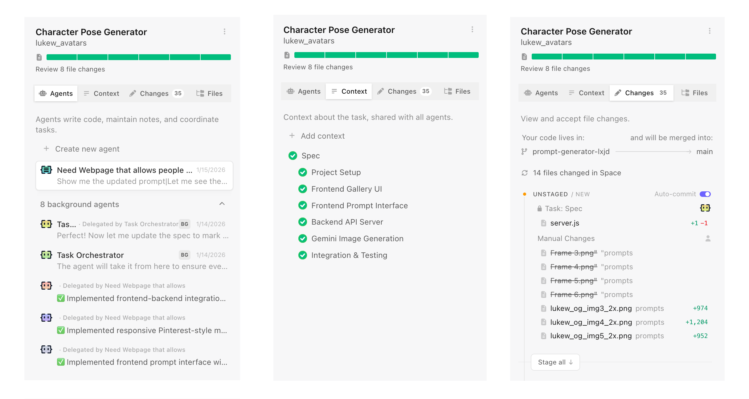
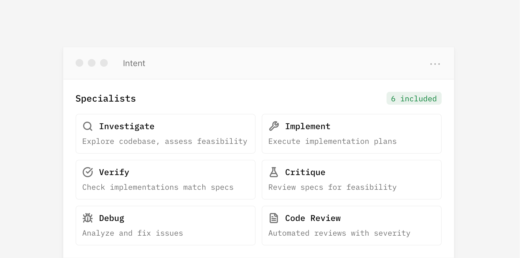
Introducing IntentIntent by Augment (in early preview today) is a new software development app with agent orchestration at its core. You're not managing individual model calls or chat threads. You're setting up workspaces, defining your intent (what you want to get done), and letting specialized agents work in parallel while staying aligned.
To ground this in a real-world analogy, if you want to accomplish a large or complicated task you need...
- A team of the right people for the job, often specialists
- To give the team the information they need to complete the job
- The right environment where the team can coordinate and work safely
That's a space in Intent in a nutshell. Software developers create a new space for every task they want to get done. Each space makes use of specific agents and context to complete the task. Each space is isolated using git worktrees so agents can work freely and safely. Fire up as many spaces as you want without having them interfere with each other.
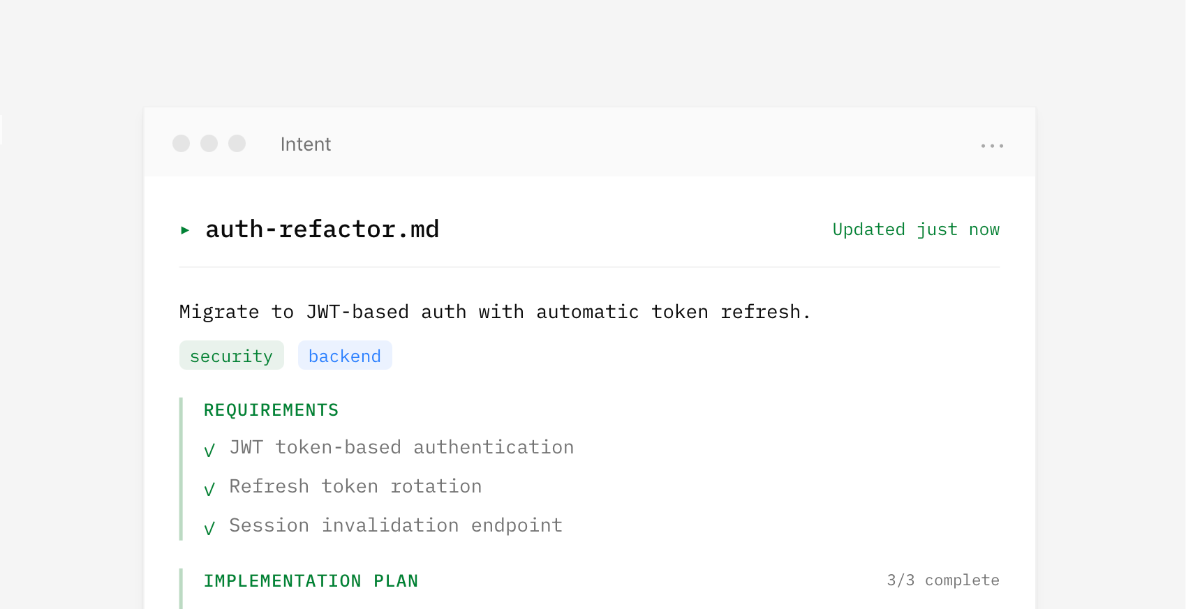
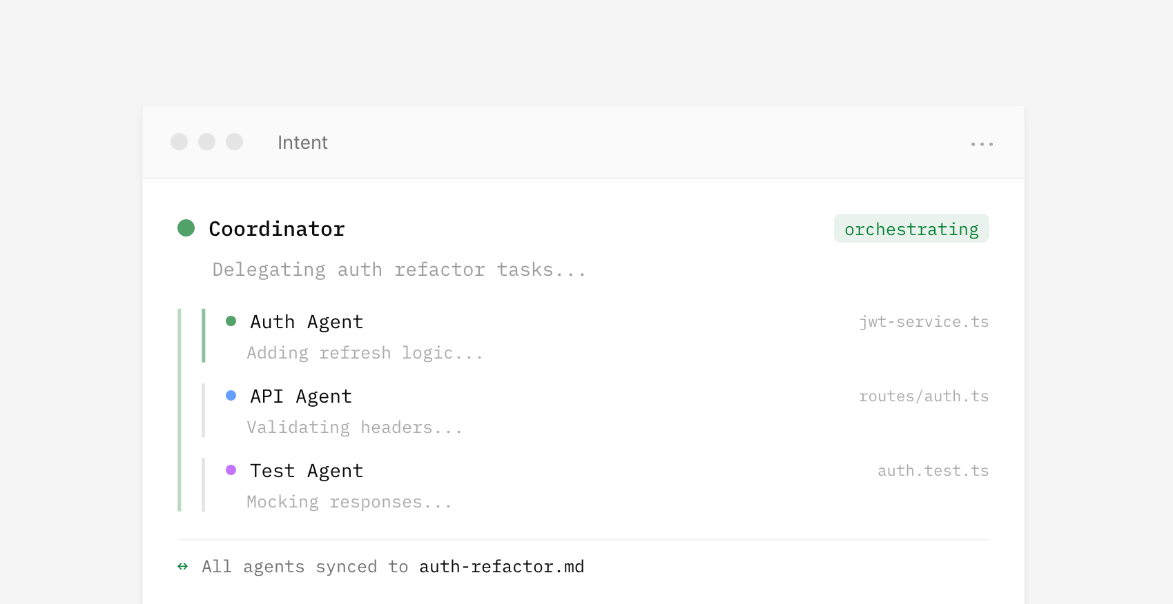
I've often said "context is king" when talking about what makes AI products effective. That's especially true when you need to coordinate the work of multiple parallel agents with varying capabilities. In Intent, context is managed by a living spec which provides a shared understanding that multiple agents can reference while working on different parts of a problem. This living spec is written and updated by a coordinator agent as it manages the work of implementer and verifier agents. It's a whole agent dev team.
Because agents operate from the same spec, parallel work becomes possible. Assumptions, tradeoffs, and decisions stay aligned and updated as code changes without requiring constant human intervention to keep things on the same page. For instance, one agent handles the theme system while another works on component styles. Both reference the same context, so their work fits together.
By default, a coordinator writes a spec and delegates to specialists for you. But you can also set up spaces with custom agents and manage your own context if you want. Think of it as manual vs. auto mode.
The UI for agent orchestration in Intent isn't a fancier chat interface. It's context management, agent specialization, and a unified developer workflow. It's not hard to squint and see very similar orchestration UI being useful for lots of other domains too.
Styling ::search-text and Other Highlight-y Pseudo-Elements
Chrome 144 recently shipped ::search-text, which is now one of several highlight-related pseudo-elements. This one selects find-in-page text, which is the text that gets highlighted when you do a Ctrl/Command + F-type search for something on a page and matches are found.
By default, ::search-text matches are yellow while the current target (::search-text:current) is orange, but ::search-text enables us to change that.
I’ll admit, I hadn’t really been following these highlight pseudo-elements. Up until now, I didn’t even know that there was a name for them, but I’m glad there is because that makes it easier to round them all up and compare them, which is exactly what I’m going to do here today, as it’s not super obvious what they do based on the name of the pseudo-element. I’ll also explain why we’re able to customize them, and suggest how.
The different types of highlight pseudo-elements Pseudo-selectorSelects…Notes::search-textFind-in-page matches::search-text:current selects the current target::target-textText fragmentsText fragments allow for programmatic highlighting using URL parameters. If you’re referred to a website by a search engine, it might use text fragments, which is why ::target-text is easily confused with ::search-text.::selectionText highlighted using the pointer::highlight()Custom highlights as defined by JavaScript’s Custom Highlight API::spelling-errorIncorrectly spelled wordsPretty much applies to editable content only::grammar-errorIncorrect grammarPretty much applies to editable content onlyAnd let’s not forget about the <mark> HTML element either, which is what I’m using in the demos below.
What should highlight pseudo-elements look like?The question is, if they all (besides ::highlight()) have default styling, why would we need to select them with pseudo-elements? The reason is accessibility (color contrast, specifically) and usability (emphasis). For example, if the default yellow background of ::search-text doesn’t contrast well enough with the text color, or if it doesn’t stand out against the background of the container, then you’ll want to change that.
I’m sure there are many ways to solve this (I want to hear “challenge accepted” in the comments), but the best solution that I’ve come up with uses relative color syntax. I took wrong turns with both background-clip: text and backdrop-filter: invert(1) before realizing that many CSS properties are off-limits when it comes to highlight pseudo-elements:
body { --background: #38003c; background: var(--background); mark, ::selection, ::target-text, ::search-text { /* Match color to background */ color: var(--background); /* Convert to RGB then subtract channel value from channel maximum (255) */ background: rgb(from var(--background) calc(255 - r) calc(255 - g) calc(255 - b)); } } CodePen Embed FallbackYour browser might not support that yet, so here’s a video that shows how the highlighted text adapts to background color changes.
What’s happening here is that I’m converting the container’s background color to RGB format and then subtracting the value of each channel (r, g, and b) from the maximum channel value of 255, inverting each channel and the overall color. This color is then set as the background color of the highlighting, ensuring that it stands out no matter what, and thanks to the new CodePen slideVars, you can mess around with the demo to see this in action. You might be able to do this with color formats besides RGB, but RGB is the easiest.
So that covers the usability, but what about the accessibility?
Well, the highlighting’s text color is the same as the container’s background color because we know that it’s the inverse of the highlighting’s background color. While this doesn’t mean that the two colors will have accessible contrast, it seems as though they will most of the time (you should always check color contrast using color contrast tools, regardless).
If you don’t like the randomness of inverting colors, that’s understandable. You can totally pick colors and write conditional CSS for them manually instead, but finding accessible colors that stand out against the different backdrops of your design for all of the different types of highlight pseudo-elements, while accounting for alternative viewing modes such as dark mode, is a headache. Besides, I think certain UI elements (e.g., highlights, errors, focus indicators) should be ugly. They should stand out in a brutalist sort of way and feel disconnected from the design’s color palette. They should demand maximum attention by intentionally not fitting in.
Keep in mind that the different types of highlight pseudo-elements should be visually distinctive too, for obvious reasons, but also in case two different types overlap each other (e.g., the user selects text currently matched by find-in-page). Therefore, in the amended code snippet below, mark, ::selection, ::target-text, and ::search-text all have slightly different backgrounds.
I’ve left mark unchanged, the r value of ::selection as it was, the g value of ::target-text as it was, and the b value of ::search-text as it was, so those last three only have two channels inverted instead of all three. They’re varied in color now (but still look inverted), and with the addition of an alpha value at 70% (100% for ::search-text:current), they also blend into each other so that we can see where each highlight begins and ends:
body { --background: #38003c; background: var(--background); mark, ::selection, ::target-text, ::search-text { color: var(--background); } mark { /* Invert all channels */ background: rgb(from var(--background) calc(255 - r) calc(255 - g) calc(255 - b) / 70%); } ::selection { /* Invert all channels but R */ background: rgb(from var(--background) r calc(255 - g) calc(255 - b) / 70%); } ::target-text { /* Invert all channels but G */ background: rgb(from var(--background) calc(255 - r) g calc(255 - b) / 70%); } ::search-text { /* Invert all channels but B */ background: rgb(from var(--background) calc(255 - r) calc(255 - g) b / 70%); &:current { /* Invert all channels but B, but without transparency */ background: rgb(from var(--background) calc(255 - r) calc(255 - g) b / 100%); } } } CodePen Embed Fallback::spelling-error and ::grammar-error are excluded from all this because they have their own visual affordances (red underlines and green underlines respectively, typically contrasted against the neutral background of an editable element such as <textarea>).
But mark, ::selection, ::target-text, and new-to-Chrome ::search-text? Well, they can appear anywhere (even on top of each other), so I think it’s important that they’re visually distinctive from each other while being accessible at all times. Again though, even fully-inverted colors can be inaccessible. In fact, the inverse of #808080 is #808080, so test, test, test! Although, maybe contrast-color() could come to the rescue once the CSS Color Module Level 5 version of it ships.
In the meantime, please, no more highlight-y elements!
Styling ::search-text and Other Highlight-y Pseudo-Elements originally published on CSS-Tricks, which is part of the DigitalOcean family. You should get the newsletter.
ReliCSS
We all have a few skeletons in our CSS closets. There’s probably that one-off !important where you can now manage that more effectively with cascade layers. Or maybe a dated Checkbox Hack that :has() has solved. Perhaps it’s been a long while since your last site redesign and it’s chock-full of vendor-prefixed properties from 2012. Thar be demons!
Stu Robson’s ReliCSS (clever name!) tool can excavate outdated CSS in your codebase that have modern CSS solutions.
Each relic is assigned a level of severity. As Stu explains it:
- High Severity: True “fossils”. Hacks for (now) unsupported browsers (IE6/7) or “dangerous” techniques. High-risk, obsolete, should be first targets for removal.
- Medium Severity: The middle ground. Hacks for older unsupported browsers (IE8-10). They work but they’re fragile. Hacks to review to see if they’re still relevant for your actual users.
- Low Severity: Modern artifacts. Usually vendor prefixes (-webkit-, -moz-). Safe mostly, but better handled by automated tools like Autoprefixer. They’re an opportunity to improve your build process.
It’s been a little while since my personal site got an overhaul. Not to toot my own horn, but heyyyyyy!
Seriously, though. I know there are things in there I’m embarrassed to admit.
But what if we do archeological dig on CSS-Tricks? I mean, it’s been at least five years since this place has gotten the love it deserves. I’m almost afraid to look. Here goes…
🫣OK, not as bad as I imagined. It’s largely vendor prefixing, which I’m sure comes courtesy of an older Autoprefixer configuration.
ReliCSS originally published on CSS-Tricks, which is part of the DigitalOcean family. You should get the newsletter.
There is No Need to Trap Focus on a Dialog Element
I was building a Modal component that uses the <dialog> element’s showModal method. While testing the component, I discovered I could tab out of the <dialog> (in modal mode) and onto the address bar.
And I was surprised — accessibility advice around modals have commonly taught us to trap focus within the modal. So this seems wrong to me.
Upon further research, it seems like we no longer need to trap focus within the <dialog> (even in modal mode). So, the focus-trapping is deprecated advice if you use <dialog>.
Some notes for youInstead of asking you to read through the entire GitHub Issue detailing the discussion, I summarized a couple of key points from notable people below.
Here are some comments from Scott O’Hara that tells us about the history and context of the focus-trapping advice:
WCAG is not normatively stating focus must be trapped within a dialog. Rather, the normative WCAG spec makes zero mention of requirements for focus behavior in a dialog.
The informative 2.4.3 focus order understanding doc does talk about limiting focus behavior within a dialog – but again, this is in the context of a scripted custom dialog and was written long before inert or <dialog> were widely available.
The purpose of the APG is to demonstrate how to use ARIA. And, without using native HTML features like <dialog> or inert, it is far easier to trap focus within the custom dialog than it is to achieve the behavior that the <dialog> element has.
Both the APG modal dialog and the WCAG understanding doc were written long before the inert attribute or the <dialog> element were widely supported. And, the alternative to instructing developers to trap focus in the dialog would have been to tell them that they needed to ensure that all focusable elements in the web page, outside of the modal dialog, received a tabindex=-1.
Léonie Watson weighs in and explains why it’s okay for a screen-reader user to move focus to the address bar:
In the page context you can choose to Tab out of the bottom and around the browser chrome, you can use a keyboard command to move straight to the address bar or open a particular menu, you can close the tab, and so on. This gives people a choice about how, why, and what they do to escape out of the context.
It seems logical (to me at least) for the same options to be available to people when in a dialog context instead of a page context.
Finally, Matatk shared the conclusion from the W3C’s Accessible Platform Architectures (APA) Working Group that okay-ed the notion that <dialog>‘s showModal method doesn’t need to trap focus.
We addressed this question in the course of several APA meetings and came to the conclusion that the current behavior of the native dialog element should be kept as it is. So, that you can tab from the dialog to the browser functionalities.
We see especially the benefit that keyboard users can, for example, open a new tab to look something important up or to change a browser setting this way. At the same time, the dialog element thus provides an additional natural escape mechanism (i.e. moving to the address bar) in, for example, kiosk situations where the user cannot use other standard keyboard shortcuts.
From what I’m reading, it sounds like we don’t have to worry about focus trapping if we’re properly using the Dialog API’s showModal method!
Hope this news make it easier for you to build components. 😉
There is No Need to Trap Focus on a Dialog Element originally published on CSS-Tricks, which is part of the DigitalOcean family. You should get the newsletter.
Responsive Hexagon Grid Using Modern CSS
Five years ago I published an article on how to create a responsive grid of hexagon shapes. It was the only technique that didn’t require media queries or JavaScript. It works with any number of items, allowing you to easily control the size and gap using CSS variables.
CodePen Embed FallbackI am using float, inline-block, setting font-size equal to 0, etc. In 2026, this may sound a bit hacky and outdated. Not really since this method works fine and is well supported, but can we do better using modern features? In five years, many things have changed and we can improve the above implementation and make it less hacky!
Support is limited to Chrome only because this technique uses recently released features, including corner-shape, sibling-index(), and unit division.
CodePen Embed FallbackThe CSS code is shorter and contains fewer magic numbers than the last time I approached this. You will also find some complex calculations that we will dissect together.
Before diving into this new demo, I highly recommend reading my previous article first. It’s not mandatory, but it allows you to compare both methods and realize how much (and rapidly) CSS has evolved in the last five years by introducing new features that make one-difficult things like this easier.
The Hexagon ShapeLet’s start with the hexagon shape, which is the main element of our grid. Previously, I had to rely on clip-path: polygon() to create it:
.hexagon { --s: 100px; width: var(--s); height: calc(var(--s) * 1.1547); clip-path: polygon(0% 25%, 0% 75%, 50% 100%, 100% 75%, 100% 25%, 50% 0%); }But now, we can rely on the new corner-shape property which works alongside the border-radius property:
.hexagon { width: 100px; aspect-ratio: cos(30deg); border-radius: 50% / 25%; corner-shape: bevel; }Simpler than how we used to bevel elements, and as a bonus, we can add a border to the shape without workarounds!
CodePen Embed FallbackThe corner-shape property is the first modern feature we are relying on. It makes drawing CSS shapes a lot easier than traditional methods, like using clip-path. You can still keep using the clip-path method, of course, for better support (and if you don’t need a border on the element), but here is a more modern implementation:
.hexagon { width: 100px; aspect-ratio: cos(30deg); clip-path: polygon(-50% 50%,50% 100%,150% 50%,50% 0); } CodePen Embed FallbackThere are fewer points inside the polygon, and we replaced the magic number 1.1547 with an aspect-ratio declaration. I won’t spend more time on the code of the shapes, but here are two articles I wrote if you want a detailed explanation with more examples:
The Responsive GridNow that we have our shape, let’s create the grid. It’s called a “grid,” but I am going to use a flexbox configuration:
<div class="container"> <div></div> <div></div> <div></div> <div></div> <!-- etc. --> </div> .container { --s: 120px; /* size */ --g: 10px; /* gap */ display: flex; gap: var(--g); flex-wrap: wrap; } .container > * { width: var(--s); aspect-ratio: cos(30deg); border-radius: 50% / 25%; corner-shape: bevel; } CodePen Embed FallbackNothing fancy so far. From there, we add a bottom margin to all items to create an overlap between the rows:
.container > * { margin-bottom: calc(var(--s)/(-4*cos(30deg))); } CodePen Embed FallbackThe last step is to add a left margin to the first item of the even rows (i.e., 2nd, 4th, 6th, and so). This margin will create the shift between rows to achieve a perfect grid.
Said like that, it sounds easy, but it’s the trickiest part where we need complex calculations. The grid is responsive, so the “first” item we are looking for can be any item depending, on the container size, item size, gap, etc.
Let’s start with a figure:
Our grid can have two aspects depending on the responsiveness. We can either have the same number of items in all the rows (Grid 1 in the figure above) or a difference of one item between two consecutive rows (Grid 2). The N and M variables represent the number of items in the rows. In Grid 1 we have N = M, and in Grid 2 we have M = N - 1.
In Grid 1, the items with a left margin are 6, 16, 26, etc., and in Grid 2, they are 7, 18, 29, etc. Let’s try to identify the logic behind those numbers.
The first item in both grids (6 or 7) is the first one in the second row, so it’s the item N + 1. The second item (16 or 18) is the first one in the third row, so it’s the item N + M + N + 1. The third item (26 or 29) is the item N + M + N + M + N + 1. If you look closely, you can see a pattern that we can express using the following formula:
N*i + M*(i - 1) + 1…where i is a positive integer (zero excluded). The items we are looking for can be found using the following pseudo-code:
for(i = 0; i< ?? ;i++) { index = N*i + M*(i - 1) + 1 Add margin to items[index] }We don’t have loops in CSS, though, so we will have to do something different. We can obtain the index of each item using the new sibling-index() function. The logic is to test if that index respect the previous formula.
Instead of writing this:
index = N*i + M*(i - 1) + 1…let’s express i using the index:
i = (index - 1 + M)/(N + M)We know that i is a positive integer (zero excluded), so for each item, we get its index and test if (index - 1 + M)/(N + M) is a positive integer. Before that, let’s calculate the number of items, N and M.
Calculating the number of items per row is the same as calculating how many items can fit in that row.
N = round(down,container_size / item_size);Dividing the container size by the item size gives us a number. If we round()` it down to the nearest integer, we get the number of items per row. But we have a gap between items, so we need to account for this in the formula:
N = round(down, (container_size + gap)/ (item_size + gap));We do the same for M, but this time we need to also account for the left margin applied to the first item of the row:
M = round(down, (container_size + gap - margin_left)/ (item_size + gap));Let’s take a closer look and identify the value of that margin in the next figure:
It’s equal to half the size of an item, plus half the gap:
M = round(down, (container_size + gap - (item_size + gap)/2)/(item_size + gap)); M = round(down, (container_size - (item_size - gap)/2)/(item_size + gap));The item size and the gap are defined using the --s and --g variables, but what about the container size? We can rely on container query units and use 100cqw.
Let’s write what we have until now using CSS:
.container { --s: 120px; /* size */ --g: 10px; /* gap */ container-type: inline-size; /* we make it a container to use 100cqw */ } .container > * { --_n: round(down,(100cqw + var(--g))/(var(--s) + var(--g))); --_m: round(down,(100cqw - (var(--s) - var(--g))/2)/(var(--s) + var(--g))); --_i: calc((sibling-index() - 1 + var(--_m))/(var(--_n) + var(--_m))); margin-left: ???; /* We're getting there! */ }We can use mod(var(--_i),1) to test if --_i is an integer. If it’s an integer, the result is equal to 0. Otherwise, it’s equal to a value between 0 and 1.
We can introduce another variable and use the new if() function!
.container { --s: 120px; /* size */ --g: 10px; /* gap */ container-type: inline-size; /* we make it a container to use 100cqw */ } .container > * { --_n: round(down,(100cqw + var(--g))/(var(--s) + var(--g))); --_m: round(down,(100cqw - (var(--s) - var(--g))/2)/(var(--s) + var(--g))); --_i: calc((sibling-index() - 1 + var(--_m))/(var(--_n) + var(--_m))); --_c: mod(var(--_i),1); margin-left: if(style(--_c: 0) calc((var(--s) + var(--g))/2) else 0;); }Tada!
CodePen Embed FallbackIt’s important to note that you need to register the variable --_c variable using @property to be able to do the comparison (I write more about this in “How to correctly use if()in CSS”).
This is a good use case for if(), but we can do it differently:
--_c: round(down, 1 - mod(var(--_i), 1));The mod() function gives us a value between 0 and 1, where 0 is the value we want. -1*mod() gives us a value between -1 and 0. 1 - mod() gives us a value between 0 and 1, but this time it’s the 1 we need. We apply round() to the calculation, and the result will be either 0 or 1. The --_c variable is now a Boolean variable that we can use directly within a calculation.
margin-left: calc(var(--_c) * (var(--s) + var(--g))/2);If --_c is equal to 1, we get a margin. Otherwise, the margin is equal to 0. This time you don’t need to register the variable using @property. I personally prefer this method as it requires less code, but the if() method is also interesting.
CodePen Embed FallbackShould I remember all those formulas by heart?! It’s too much!
No, you don’t. I tried to provide a detailed explanation behind the math, but it’s not mandatory to understand it to work with the grid. All you have to do is update the variables that control the size and gap. No need to touch the part that set the left margin. We will even explore how the same code structure can work with more shapes!
More ExamplesThe common use case is a hexagon shape but what about other shapes? We can, for example, consider a rhombus and, for this, we simply adjust the code that controls the shape.
From this:
.container > * { aspect-ratio: cos(30deg); border-radius: 50% / 25%; corner-shape: bevel; margin-bottom: calc(var(--s)/(-4*cos(30deg))); }…to this:
.container > * { aspect-ratio: 1; border-radius: 50%; corner-shape: bevel; margin-bottom: calc(var(--s)/-2); } CodePen Embed FallbackA responsive grid of rhombus shapes — with no effort! Let’s try an octagon:
.container > * { aspect-ratio: 1; border-radius: calc(100%/(2 + sqrt(2))); corner-shape: bevel; margin-bottom: calc(var(--s)/(-1*(2 + sqrt(2)))); } CodePen Embed FallbackAlmost! For an octagon, we need to adjust the gap because we need more horizontal space between the items:
.container { --g: calc(10px + var(--s)/(sqrt(2) + 1)); gap: 10px var(--g); }The variable --g includes a portion of the size var(--s)/(sqrt(2) + 1) and is applied as a row gap, while the column gap is kept the same (10px).
CodePen Embed FallbackFrom there, we can also get another type of hexagon grid:
CodePen Embed FallbackAnd why not a grid of circles as well? Here we go:
CodePen Embed FallbackAs you can see, we didn’t touch the complex calculation that sets the left margin in any of those examples. All we had to do was to play with the border-radius and aspect-ratio properties to control the shape and adjust the bottom margin to rectify the overlap. In some cases, we need to adjust the horizontal gap.
ConclusionI will end this article with another demo that will serve as a small homework for you:
CodePen Embed FallbackThis time, the shift is applied to the odd rows rather than the even ones. I let you dissect the code as a small exercise. Try to identify the change I have made and what’s the logic behind it (Hint: try to redo the calculation steps using this new configuration.)
Responsive Hexagon Grid Using Modern CSS originally published on CSS-Tricks, which is part of the DigitalOcean family. You should get the newsletter.
Open Props @custom-media Recipes
The @custom-media at-rule has landed in Firefox Nightly! I couldn’t find it in the release notes but Adam Argyle’s on the beat noting that it’s behind a flag for now.
Look for layout.css.custom-media.enabledI often forget the exact name of an @media query or simply get tired writing something like @media screen and (prefers-reduced-motion: no-preference) over and over again. @custom-media will be a nice bit of relief to the ol’ muscle memory because it allows us to create aliases for queries.
In fact, Adam’s Open Props project has more than 45 of them that make for excellent recipes:
@custom-media --motionOK (prefers-reduced-motion: no-preference); @media (--motionOK) { /* animations and transitions */ }Open Props @custom-media Recipes originally published on CSS-Tricks, which is part of the DigitalOcean family. You should get the newsletter.
Design Tools Are The New Design Deliverables
Design projects used to end when "final" assets were sent over to a client. If more assets were needed, the client would work with the same designer again or use brand guidelines to guide the work of others. But with today's AI software development tools, there's a third option: custom tools that create assets on demand, with brand guidelines encoded directly in.
For decades, designers delivered fixed assets. A project meant a set number of ads, illustrations, mockups, icons. When the client needed more, they came back to the designer and waited. To help others create on-brand assets without that bottleneck, designers crafted brand guidelines: documents that spelled out what could and couldn't be done with colors, typography, imagery, and layout.
But with today's AI coding agents, building software is remarkably easy. So instead of handing over static assets and static guidelines, designers can deliver custom software. Tools that let clients create their own on-brand assets whenever they need them.
This is something I've wanted to build ever since I started using AI image generators within Google years ago. I tried: LoRAs, ControlNet, IP-Adapter, character sheets. None of it worked well enough to consistently render assets the right way. Until now.
LukeW Character MakerSince the late nineties, I've used a green avatar to represent the LukeW brand: big green head, green shirt, green trousers, and a distinct flat yet slightly rendered style. So to illustrate the idea of design tools as deliverables, I build a site that creates on-brand variations of this character.
The LukeW Character Maker allows people to create custom LukeW characters while enforcing brand guidelines: specific colors, illustration style, format, and guardrails on what can and can't be generated. Have fun trying it yourself.
How It WorksSince most people will ask... a few words on how it works. A highly capable image model is critical. I've had good results using both Reve and Google's Nano Banana but there's more to it than just picking an image model.
People's asset creation requests are analyzed and rewritten by a large language model that makes sure the request aligns with brand style and guidelines. Each generation also includes multiple reference images as context to keep things on rails. And last but least, there's a verification step that checks results and fixes things when necessary. For instance, Google's image generation API ignores reference images about 10-20% of the time. The validation step checks when that's happening and re-renders images when needed. Oh, and I built and integrated the software using Augment Code.
The LukeW Character Maker is a small (but for me, exciting) example of what design deliverables can be today. Not just guidelines. Not just assets. But Tools.
HTTP Archive 2025 Web Almanac
I love me some good web research reports. I’m a sucker for them. HTTP Archive’s Web Almanac is one report I look forward to every year, and I know I’m not alone there. It’s one of those highly-anticipated publications on the state of the web, chock-full of well-documented findings about millions of live websites — 17.2 million in this edition! — from page content, to performance, to accessibility, to UX, to… well, let’s just get to it.
It just came out, so there’s no way I’ve read through all 15 chapters, let alone digested and reflected on everything in it. Really, I just want you to be aware that it’s out. That said, it’s hard for me to resist sharing at least a few notable stats that hit me and that I’ll be sure to dig into.
Some highlights:
- New text-wrap values are showing up! It’s small, but not surprising for features that only shipped as far back as 2023. Specifically, I’m looking at the balance (2.67%) and pretty (1.71%) values.
- Variable fonts are no longer a novelty. “How popular are variable fonts? This year, 39.4% of desktop websites and 41.3% of mobile websites used at least one variable font on their pages. In other words, now about 4 in 10 sites are using variable fonts.”
- Why can’t we nail down color contrast?! Only 30% of sites meet WCAG guidelines, and though that’s a number that’s trending up (21% in 2020), that’s a sorry stat.
- Removing focus styles is an epidemic. A whopping 67% of sights remove focus outlines despite WCAG’s requirement that “Any keyboard operable user interface has a mode of operation where the keyboard focus indicator is visible.”
- Many images are apparently decorative. At least, that’s what 30% of sites are suggesting by leaving the alt attribute empty. But if we consider that 14% of sites leave off the attribute completely, we’re looking at roughly 44% of sites that aren’t describing their visual content. On that note, your images probably are not decorative.
- ARIA labels are everywhere. We’re looking at 70% usage (29% on buttons). This doesn’t mean anything in and of itself. It could be a good thing, but could also be an issue without proper usage.
- The CMS landscape is largely unchanged. I mean, WordPress is still the dominant force, and that’s no dang surprise. At this point, its expansion wavers between a couple percentage points every year. “These changes suggest that WordPress is shifting from a focus on expansion to one on stabilization.” That’s a good thing.
- Bloat, bloat, bloat. “In July 2015, the median mobile home page was a meager 845 KB. As of July 2025, the same median page is now 2,362 KB. The page decade brought a 202.8% increase.” In a perfect world where we’re all super conscious about page weight, I’d say we oughta aim for less than half that total.
- JavaScript be heavy. Images are heaviest, of course, but 697 KB of JavaScript is a lot to stomach. That massive growth in page weight since 2015 is more support that this was a lost decade we must reckon with.
HTTP Archive 2025 Web Almanac originally published on CSS-Tricks, which is part of the DigitalOcean family. You should get the newsletter.
“I Heart CSS” DailyDev Squad
If you’re reading this, chances are you already have some sort of way that you’re following when we publish new content, whether that’s RSS, Bluesky, Mastodon, or what have you. But I know a lot of folks like to use DailyDev as well and, if that’s you, we have a couple of ways you can get our stuff there as well. There’s our channel that automatically pulls in new content. There’s also a community page — what DailyDev calls a “squad” — where we curate our content as well as other interesting CSS-y links of interest, called I Heart CSS.
See you there?
“I Heart CSS” DailyDev Squad originally published on CSS-Tricks, which is part of the DigitalOcean family. You should get the newsletter.
What’s !important #3: Popover Context Menus, @scope, New Web Platform Features, and More
The developer community hasn’t wasted any time kicking off 2026 with some really great articles, demos, and insights. Firefox 147 and Chrome 144 also shipped, and while they’re not jam-packed with features, the releases are still pretty exciting for what’s normally a slow time of year, so without further ado, here’s what’s important from the last couple of weeks (or should I say the first couple of weeks, of 2026?)…
Building popover context menus with anchor positioningChris Coyier (a familiar name, perhaps) shows us how to build context menus using popovers and anchor positioning over at Frontend Masters. Interest invokers, <menu>, discrete transitions, @starting-style, and fallback positions are also mentioned, so grab a pickaxe, because this one’s a bit of a goldmine.
Also, anchor positioning went baseline this week, so you can use it on production websites now! Do we have our CSS feature of the year already?
Scoping CSS with @scopeFunnily enough, I also got the opportunity to write something for Frontend Masters, and I went with @scope. @scope has been my most-anticipated CSS feature for quite a while now, and Firefox shipping it in their final release of the year (making it baseline) made it my feature of the year, so I’m very happy to kick off 2026 with this little how-to on using @scope and scoping CSS overall.
Generating gradient borders from an image sourceIn this demo, created and posted by Ana Tudor on Bluesky, Ana blurs an image and masks it with a border. You can actually accomplish this in Safari using just three lines of CSS, but the cross-browser solution isn’t too complex either (the key parts are the backdrop-filter and mask CSS properties).
Given the current popularity of gradients, blurs, and dare I say it, glass, it’s a pretty sweet effect that you can probably adapt for other scenarios.
Offset gradient border from img source – how would you get the result from the screen below? Real gap transparency, border gradient obtained from the image.
My solutions on @codepen.io:
Safari only in 3 declarations codepen.io/thebabydino/…
Cross-browser
codepen.io/thebabydino/…
#CSS #filter
[image or embed]
HTML, like CSS, is soooo good now. That being said, even though we’ve been getting all these new HTML elements that enable us to build interactive components without JavaScript, that doesn’t necessarily mean that we should. Stephen Margheim says that tab components are over-engineered most of the time, and explains why and what you can do instead.
A hot take after seeing yet another fancy tabs design: the classic "tab component" is over-engineered for 90% of use cases. You probably don't need it…
— Stephen Margheim (@fractaledmind.bsky.social) 3 January 2026 at 19:57 Using your OS as a CMSSpeaking of simplicity, Jim Nielsen introduced me to this incredibly cool OS-as-a-CMS concept as he explains how he got “Edit Post” buttons on his website to open the local document on his computer in iA Writer, completely negating the need for a CMS. Jim walks you through the whole thing, but the key ingredient is just a little link with a custom URL scheme:
<a href="ia-writer://open?path=posts:post.md">Edit</a>I love this because I also write in Markdown (using iA Writer, no less), and could will easily integrate this into my Eleventy build. But it got me thinking: do any other apps have their own URL scheme? Well, as it turns out, some of them do! Here’s an incomplete list (with examples of ‘edit’ commands for each app):
- Obsidian: obsidian://open?vault=posts&file=post
- VS Code: vscode://exact/path/to/post.md:9:1 (:9:1 is the line and column number)
- Ulysses: ulysses://x-callback-url/open-item?id=ITEM_ID
- Sublime Text (with subl protocol): subl://exact/path/to/post.md:9:1
- Apple Shortcuts: shortcuts://run-shortcut?name=Edit&input=/path/to/post.md (great for doing stuff with apps that don’t have custom URL schemes)
As you know (hopefully?), we post Quick Hits throughout the week. The best way to find them is in the sidebar of the homepage, and they’re either links to things that you can read in just a minute or two, or just PSAs to read and remember. Anyway, here’s what you might’ve missed:
- HTML Document Outline died (it was never really alive, to be fair)
- Scroll-fade didn’t die, but we’re hoping that it does
- Chris Coyier quickly explained how !important works with custom properties
- ReliCSS shipped, which helps you to replace any CSS hacks with @supports and modern CSS
- Temani Afif coded Mario World with CSS
Ready for the first cool demo of the year?
A mini Mario world with keyboard control. Yes, you can move Mario and also jump! 👀
Demo: codepen.io/t_afif/full/… via @codepen.io
✔️ 100% CSS Magic
✔️ Minimal HTML
❌ 0% JavaScript
A Chrome-only experimentation using modern CSS.
[image or embed]
And finally, here are my top picks from what Firefox and Chrome shipped on Tuesday:
- Firefox 147
- Anchor positioning (now Baseline!)
- View transition types (also Baseline!)
- Navigation API (a now-Baseline JavaScript API that replaces the History API and window.location)
- Chrome 144
- ::search-text (only Chrome supports this pseudo-element that selects highlighted find-in-page text)
- <geolocation> (only Chrome supports this HTML element that requests the user’s location declaratively)
- Temporal API (Chrome joins Firefox in supporting this replacement for JavaScript’s Date API, which Piccalilli wrote about)
Thanks for tuning in. I’ll see you in two weeks! Be there or be square (aspect-ratio: 1)!
What’s !important #3: Popover Context Menus, @scope, New Web Platform Features, and More originally published on CSS-Tricks, which is part of the DigitalOcean family. You should get the newsletter.
AI Enables As-Needed Software Features
In traditional software development, designers and engineers anticipate what people might need, build those features, and then ship them. When integrated into an application, AI code generation upends this sequence. People can just describe what they want and the app writes the code needed to do it on demand.
Reve's recent launch of Effects illustrates this transition. Want a specific film grain look for your image or video? Just describe it in plain language or upload an example. Reve's AI agent will write code that produces the effect you want and figure out what parameters should be adjustable. Those parameters then become sliders in an interface built for you in real-time.
Instead of having to find the menu item for an existing filter (if it even exists) in traditional software, you just say what you want and the system constructs it right then and there.
When applications can generate capabilities on demand, the definition of "what this product does" becomes more fluid. Features aren't just what shipped in the last release, they're also what users will ask for in the next session. The application becomes a platform for creating its own abilities, guided by user intent rather than predetermined roadmaps.
Playing With CodePen slideVars
Super cool new CodePen feature alert! You’ve probably seen a bunch of “interactive” demos that let you change values on the fly from a UI panel embedded directly in the demo. Jhey’s demos come immediately to mind, like this one:
CodePen Embed FallbackThat’s a tool called TweakPane doing the work. There’s another one called Knobs by Yair Even Or that Adam Argyle often uses:
CodePen Embed FallbackI’ve often faked it with either the Checkbox Hack or a sprinkle of JavaScript when I’m demoing a very specific concept:
CodePen Embed FallbackOK, enough examples because CodePen has a homegrown tool of its own called slideVars. All you have to do is import it and call it in the JavaScript panel:
import { slideVars } from "@codepen/slidevars"; slideVars.init();You can import it into a project off CodePen if you’re so inclined.
That two-liner does a lot of lifting. It auto-detects CSS variables in your CSS and builds the panel for you, absolutely-positioned in the top-right corner:
CodePen Embed FallbackIt looks like you have to declare your variables on the :root element with default usage. I tried scoping them directly to the element and it was a no-go. It’s possible with a manual configuration, though.
CodePen Embed FallbackPretty cool, right? You can manually configure the input type, a value range, a default value, unit type, and yes, a scope that targets the element where the variables are defined. As far as units go, it supports all kinds of CSS numeric units. That includes unit-less values, though the documentation doesn’t explicitly say it. Just leave the unit property as an empty string ("").
I guess the only thing I’d like is to tell slideVars exactly what increments to use when manually configuring things. For example, unit-less values simply increment in integers, even if you define the default value as a decimal:
CodePen Embed FallbackIt works in default mode, however:
CodePen Embed FallbackThere’s a way to place the slideVars wherever you want by slapping a custom element where you want it in the HTML. It’s auto-placed at the bottom of the HTML <body> by default.
<slide-vars> <p>Custom Label!</p> </slide-vars>Or CSS it by selecting the custom element:
CodePen Embed FallbackSo much fun!
CodePen Embed FallbackPlaying With CodePen slideVars originally published on CSS-Tricks, which is part of the DigitalOcean family. You should get the newsletter.
Postcard From Web Directions Dev Summit, 2025
Author’s Note: There are already wonderful recaps of the Web Directions Developer Summit I spoke at in November 2025. So, rather than offering another one, I decided to capture my experience at the conference in a stream-of-consciousness style that details my battles with stage fright and imposter syndrome. I haven’t seen this style used on a tech blog before, but CSS-Tricks has become my playground for experiments — not just with CSS, but with language itself — so let’s see where this experiment takes us.
ArrivalWhen I was a kid, there used to be a Museum railway station in Melbourne, Australia. In 1995, it changed its name to match the shopping center above it — a microcosm of how the mentality of my home city has shifted — but Sydney still has a Museum station. The aesthetics of Sydney’s Museum Station evoke London Underground vibes as my train from Sydney Airport stops under Hyde Park, the oldest public park in Australia and the first to be named after its more famous London counterpart.
Britain’s on my brain because I want this trip to resemble the Harry Potter stories: the wish-fulfillment narrative of discovering you have special powers and are chosen. In truth, the way I was selected to speak at the Web Directions Dev Summit this year wasn’t so spontaneous.
The organizer, John Allsopp, recommended my article “How to Discover a CSS Trick” on his reading list and connected with me on LinkedIn. I took the opportunity to pitch via direct message for a talk about scrolling since the proposal form on the Web Directions website felt comparatively impersonal. But now, what feels impersonal and daunting is the parallel-universe version of a train station that doesn’t exist back home except in my memory. Stepping onto the platform like an eleventh-hour rehearsal for the stage, I feel less like the Harry Potter of CSS and more like I’ve signed up to be a novelty museum exhibit. Step right up and laugh at the middle-aged dude who writes bizarre articles featuring a fictional seller of haunted CSS tricks who cursed him to overuse CSS for everything.
The spooky CSS shopkeeper is a figment of my imagination based on watching too many Simpsons reruns — but now I’ve manifested a real-life froghurt situation: a free conference ticket and trip to Sydney in exchange for embarrassing myself in front of the largest audience I’ve ever spoken to.
I procrastinate preparation by sitting down for frozen yoghurt in the Sydney CBD. The froghurt is yummy, but cursed by the cloud of anxiety following me around on this sunny day. So I’ll procrastinate describing my own talk to you by first sharing a few of my favorites from others.
Day OneI’ve arrived and the event kicks off.
Welcome: John AllsoppThe moment John takes the stage, I’m struck by his showmanship in subverting assumptions about his enthusiasm for tech. He opens by saying he feels ennui with web development, yet hopes the lineup over the next two days might snap him out of his pessimism about the web’s future.
It’s the conference equivalent of the literary technique of a frame story: He positions himself as a weary sage who will reappear after each talk for Q&A — and yet, as someone who predates PCs, he has greyed like an unavailable option on a computer screen. He fears he has seen too much to feel optimistic about the future of the web he helped to build.
He says front-end development has reached a “local maximum,” borrowing a term from calculus to explain how the tools that got us here have flattened our rate of change. The productivity boost is offset by the ways our tools limit imagination. Our mental models make it easy to build the same websites again and again, keeping us out of touch with what modern browsers can do.
He cites the View Transitions API — available as a progressive enhancement since 2023 — as an example of a native browser superpower that could subvert the SPA model, yet remains only experimentally supported in React.
The dramatic context for the next two days is now set. The web sucks, but prove him wrong, kids.
“The Browser Strikes Back: Rethinking the Modern Dev Stack” by Jono Alderson“You’re gonna hate me,” says the keynote speaker Jono Alderson at the top of his talk on rethinking the modern dev stack.
He argues that frameworks like React are Rube Goldberg machines built around limitations that no longer exist. He compares them to Netflix’s DVD-by-mail era: We’re still sending discs when we could be streaming.
He runs through browser capabilities in 2025 that we routinely overlook when we reflexively reach for frameworks — and includes a teaser slide for my later talk on scroll timelines. I feel a sense of belonging and dread simultaneously, like passing the chicken exit on Space Mountain.
In the break, Jono admits to me that he was nervous about triggering anger by bashing frameworks. I hope the audience is warming to favoring the platform, because my talk shares that same underlying spirit, albeit through the specific example of CSS Scroll-Driven Animations. It helps that Jono served as frontline fodder, since research shows that everything sounds more credible with a British accent, even if Jono’s was slightly slurred from jet lag.
Whether he’s right about nuking frameworks or not, it’s healthy to reassess whether we need a dependency list longer than our screen port. I first questioned this in 2015 after watching Joe Gregorio argue we should stop using frameworks and rely on the platform — a talk that, in hindsight, looked suspiciously like guerrilla marketing for Google Polymer. I adopted Polymer for a major project. It was more like a framework than a library, but with the “bonus” of not being battle-tested like React: it had its own weird build process, reliance on a browser feature that never became a standard, and a promised future that never arrived. I ended up rewriting everything. Eventually, Polymer itself was quietly put out of its misery.
Even so, I love the idea of web components: transforming the browser into something built for the way we already force it to behave. A decade later, has the situation improved enough to yarn remove React? The answer may go beyond browser capability in 2025.
Over coffee, Jono and I discuss how LLMs are trained on oceans of React, reinforcing the assumption that every web app must be an SPA. Escaping React is harder than ever when the future of work is dragging us back into the past, much the way recommendation algorithms on social media trap us in our own echo chambers.
“It’s only gonna get worse,” says Jono.
And I guess it will, unless we start creating good examples of what browsers can do without dependencies.
“Supercharged Scrolling With CSS” by Me Photo credit: Kris HowardIt’s debatable whether you should admit you’re nervous while giving a talk. Most say you shouldn’t. The balance I strike is to open with a self-deprecating joke as a way to get the scrolling discussion rolling.
“I have a feeling some of you might be scrolling on your devices as we speak, so I urge you to look up — and let’s scroll together for the next half hour.”
It gets a laugh. It’s a moment where I translate my CSS-Tricks article style — self-referential, breaking the fourth wall — into something that works on stage. This is my challenge for the talk: How do I adapt a year’s worth of articles about my autistic special interest into thirty minutes?
It brings to mind the movie Adaptation, where Nicolas Cage plays a screenwriter with imposter syndrome trying to adapt an unfilmable book into the movie we’re watching. Unlike my articles, I decide I shouldn’t launch abruptly into the crazy CSS experiments I built in my basement.
First, I need to answer why me, this random guy, thinks scrollytelling warrants half an hour of the audience’s time. I can’t assume much about this audience. Kris Howard will later comment on her blog that “Lee Meyer’s session introduced me to a new term – scrollytelling.”
I borrow credibility from The New York Times, name-checking its high-profile examples of scrollytelling, one of which won a Pulitzer Prize. John helpfully drops the link to the “Snow Fall” article into the livestream chat, just as I’d add links if this were an article.
But there’s another element of my writing that doesn’t translate: long code snippets. They’re too complex to explain on stage. Doing so would be a suicide mission. Let’s do it anyway.
I’ve used reveal.js in the past for an online presentation at Games For Change, and reveal.js supports automatic animations between code blocks. I use that to demonstrate how newer CSS syntax can drastically shorten code. It doesn’t matter that nobody can fully parse the old syntax at a glance; that’s the point of the animation. I ask for a show of hands for who would rather write the new syntax than the old?
Adapting my articles for the stage is my opportunity to rewrite history to appear logical. The order of discovery of the building blocks I will use for my final demo appears intentional rather than the chaotic trail I have been leaving across CSS-Tricks since 2024. But now it’s time to tackle the final demo like the boss battle it is.
I ask for a show of hands: Should I fight the bad guy unarmed, or run away? The audience is split evenly, which is the one outcome I didn’t plan for.
In Adaptation, when Cage’s character is running out of time to finish his script, he panics and seeks advice from screenwriting guru Robert McKee, who tells him: Your story can be flawed throughout, but wow them in the end, and you’ve got a hit. As much as I’m my own worst critic, I know I have something with this final demo, the kind that would make a leader on the Google Chrome team tweet “Wow!” That tweet hasn’t happened yet while I’m on stage, as I’m wondering how this crowd will react.
I let the bad guy kill the hero first. I make the antagonist seem unbeatable. Then I refresh, scroll in the opposite direction, climb a ladder, collect a lightsaber, and kill the bad guy.
McKee warned Cage’s writer character not to cheat at the end with a deus ex machina. A magic lightsaber to save the day feels like one for sure, but by a stroke of synchronicity, Star Wars imagery has been appearing in talks all day. John Allsopp even joked that it’s a theme he didn’t get the memo about. I reference this overarching theme, and the lightsaber feels earned. The pixel art guy kills the bad guy with one blow. The applause is loud enough to be heard on the livestream, even though the audience isn’t miked.
Can we end on that high note? Research shows that time dilates for people onstage with high public-speaking anxiety. Ironically, in a talk about controlling timelines, I realize I’ve lost control of the time, and I’m about to run out of slides too early.
So, I replay the demo and discuss its subtext. The scrollytelling pixel guy can be a novelty toy or he can be ergodic literature, an autobiographical allegory. I refresh again. “Scroll left or right to flee or fight,” says the pixel art guy. I explain the deeper psychological truth behind the simplistic story and retro graphics.
“You can tell them anything if you just make it funny, make it rhyme, and if they still don’t understand you, then you run it one more time.”
— Bo Burnham in “Can’t Handle This” View Slides Happy Hour and Speaker DinnerEvery autistic person should receive a voucher that grants them access to one social situation where people come and talk to them about the thing they are obsessed with. One piece of feedback in particular made me feel seen: Someone tells me a more traditional tutorial would have been fine, but the direction I took was playful, which felt refreshing in a world where discussions of web development can become depressingly utilitarian. He doesn’t know that the first blog I ever created was playfulprogramming.com, so I’ve always been about finding joy in development.
Someone else told me it was their favorite talk in the conference, and that I was brave for embracing my Jewishness publicly by mentioning the Torah as an illustration of the meaning of scrolling to me. Given what happened in Sydney a month after I left, it may not have been bravery so much as my obliviousness to the current vibes in my country, since I am a more frequent reader of CSS-Tricks than the news.
Day TwoThe Sydney weather cools, mirroring my more chilled mood today. With my presentation behind me, I now walk toward the venue like an anonymous attendee who magically got a free ticket. I brace myself for a morning of AI-heavy talks. My year at work was an AI overdose.
“What’s Beyond the Browser: The AI Platform Shift” by Rupert ManfrediWalking to the University of Technology Sydney, the combo of venue and theme reminds me of John Barth’s Giles Goat-Boy, in which the world is represented as a university controlled by an AI. Authorship itself is disputed in the fictional preface, with both Barth and the AI claiming only to have edited the work — eerily prescient in 1966 of the state of work in 2026. AI is great until there’s a defect. Then humans blame the AI, and the AI blames humans for misunderstanding its limits.
The novel satirized the Cold War. A Marxist might say intellectual property can’t exist because creative work is always a product of the zeitgeist. Although the tech that Rupert Manfredi’s demos blurs the lines of authorship by doing away with discrete apps and websites and composing UIs to meet the user’s needs on the fly, he is probably not a commie. He suggests that creators would still get paid. Perhaps this will finally be the day in the sun for HTTP 402 Payment Required.
Rupert’s talk, “What’s Beyond the Browser,” is daring. He demos “Telepath,” a prototype computer with no browser and no apps. He envisages that future developers will transfer their skills to create only fragments and services that AI can synthesize into a tailored user experience. He argues web development has never really been about learning React hooks, but about solving user problems: critical paths, information quality, and creativity. These are more fundamental to a developer’s skillset than any tools they happen to use.
That resonates with how I think about my work on CSS-Tricks: They are fragments of expression that gain meaning when woven into a larger tapestry by the people or machines who learn from them. If basic functionality becomes trivial, developers can focus on the problems nobody has solved yet.
“A False Sense of Accessibility: What Automated Testing Tools Are Missing” by Beau VassAs I mentioned before, I am autistic. So are my kids. It’s an invisible disability, and I’m careful to let the kids know the world won’t rearrange itself around our autism. Just as you can’t make something accessible to everyone, you can’t make the accessible experience the same as everyone else’s any more than you can make it easy for my son to succeed in a school system that was never designed with neurodiverse people in mind.
Accessibility is often less about universal comfort than about ensuring there’s a viable path for the people who truly need the content. When you think about it, the users’ faculties are part of the platform. Accessibility is, therefore, as fundamental as browser compatibility.
In his talk, “What Automated Tools Are Missing,” speaker Beau Vass demonstrates how automated audits flag non-issues while missing critical failures, sometimes making accessibility worse when followed blindly. A decorative image without alternative text might be flagged, yet adding it could also actively harm screen-reader users. The problem isn’t automated tools themselves; it’s when passing a Lighthouse audit becomes the goal. Tools only recognize what they’re taught, and AI trained on a broken web will faithfully reproduce its mistakes. As one of my workmates likes to say: “Use your tools, but don’t let them turn you into a tool.”
Accessibility isn’t a froghurt topping. It can’t be added at the end, not even in principle. The responsibility is shared across design, content, engineering, and testing, and it requires direct input from people with disabilities. Accessibility may be subjective, but making the web accessible should still be easier than making the physical world accessible. When we fail, it’s another reminder that tooling alone won’t save us.
AI won’t solve accessibility, but it may become useful once we stop asking it to. There aren’t enough good examples on the web for models to learn from, which means we can’t expect Claude Code to fix our sites. That said, AI can already simulate how a screen reader user might attempt to complete a task and surface where friction occurs. BrowserStack does this already. Ironically, it may be easier for a machine to put itself in the shoes of a disabled human than for a non-disabled human to do the same, and Beau believes it won’t be AI that changes the game, but laws and regulations requiring people to care about accessibility. Beau believes it’s more laws and regulations that will be a game-changer for accessibility than AI.
DepartureAll flights are delayed an hour, as if Sydney itself is resisting my return to Melbourne — and the end of this article. But back when I was young and teaching myself to write, I read a book about writing articles that said the more a piece seems to be about everything, the more it’s about nothing. Soon, we must end the article.
It ends with me waiting to take flight, thinking about how Chris Coyier once said his greatest pride wasn’t a single moment of accomplishment, but the “aggregate moments” of sustained focus on his professional passions. The afterglow of this conference is the sum of a year obsessing over animation timelines — and what you’ll do with the knowledge if I end this article at the right moment.
But does that magical moment even exist? Animation timelines work because we can pause motion on a screen. But if we could do that in real life, then, according to Zeno’s arrow paradox, my plane could never land. At every bullet-time instant, the plane would appear at rest, which would make all movement — including my entire journey — an illusion.
John Allsopp worried that the web itself might be stuck in that illusion of progress. But Aristotle answered Zeno’s arrow paradox by saying discrete instants of time don’t exist, only the flow of time. Reality is made of the aggregate moments that Chris Coyier said have meaning to him. As I wait for a plane that seems incapable of landing, my phone buzzes with my favorite feedback from the conference: a graduate developer amazed by “the scroll section in the Dev Summit.” I love that he calls it a section, not a talk, as if it blended seamlessly into a two-day narrative flow, foreshadowing a future web that unfurls like an infinite scroll.
“This story will never end. This story ends.”
— John BarthPostcard From Web Directions Dev Summit, 2025 originally published on CSS-Tricks, which is part of the DigitalOcean family. You should get the newsletter.
More on Context Management in AI Products
In AI products, context refers to the content, tools, and instructions provided to a model at any given moment. Because AI models have context limits, what's included (aka what a model is paying attention to) has a massive impact on results. So context management is key to letting people understand and shape what AI products produce.
In Context Management UI in AI Products I looked at UI patterns for showing users what information is influencing AI model responses, from simple context chips to nested agent timelines. This time I want to highlight two examples of automatic and manual context management solutions.
Augment Code's Context Engine demonstrates how automatic context management can dramatically improve AI product outcomes. Their system continuously indexes code commit history (understanding why changes were made), team coding patterns, documentation, and what developers on a team are actively working on.
When a developer asks to "add logging to payment requests," the system identifies exactly which files and patterns are relevant. This means developers don't have to manually specify what the AI should pay attention to. The system figures it out automatically and delivers much higher quality output as a result (see chart below).
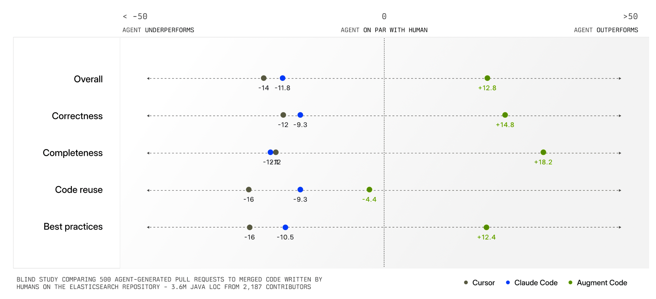
Having an intelligent system manage context for you is extremely helpful but not always possible. In many kinds of tasks, there is no clear record of history, current state, and relevance like there is in a company's codebase. Also, some tasks are bespoke or idiosyncratic meaning only the person running them knows what's truly relevant. For these reasons, AI products also need context management interfaces.
Reve's creative tooling interface not only makes manual context management possible but also provides a consistent way to reference context in instructions as well. When someone adds a file to Reve, a thumbnail of it appears in the instruction field with a numbered reference. People can then use this number when writing out instructions like "put these tires @1 on on my truck @2".
It's also worth noting that any file uploaded to or created by Reve can be put into context with a simple "one-click" action. Just select any image and it will appear in the instruction field with a reference number. Select it again to remove it from context just as easily.
While the later may seem like a clear UI requirement, it's surprising how many AI products don't support this behavior. For instance, Google's Gemini has a nice overview panel of files uploaded to and created in a session but doesn't make them selectable as context.
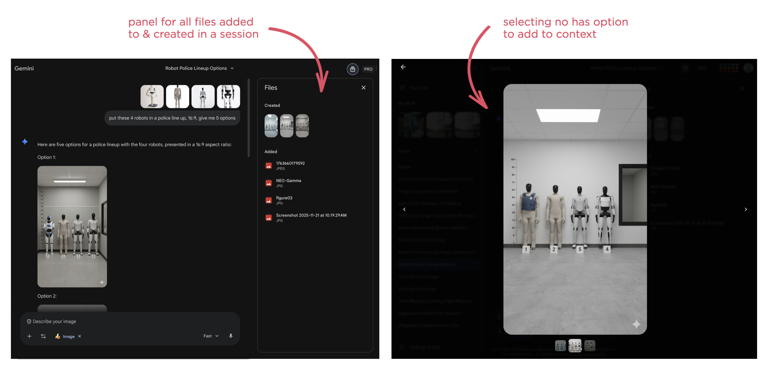
As usual, AI capabilities keep changing fast. So context management solutions, whether automatic or manual, and their interfaces are going to continue to evolve.
AI Coding Agents for Designers
In an increasing number of technology companies, the majority of code is being written by AI coding agents. While that primarily boosts software developer productivity, they aren't the only ones that can benefit from this transformation. Here's how AI coding agents can also help designers.
As AI coding agents continue to improve dramatically, developers are turning to them more and more to not only write code but to review and improve it as well. The result isn't just more coder faster but the organizational changes needed to support this transition as well.
"The vast majority of code that is used to support Claude and to design the next Claude is now written by Claude. It's just the vast majority of it within Anthropic. And other fast moving companies, the same is true."- Dario Amodei, Anthropic CEO "Codex has transformed how OpenAI builds over the last few months."
- Sam Altman, OpenAI CEO
As just one example, a product manager I speak with regularly now spends his time using Augment Code on his company's production codebase. He creates a branch, prompts Augment's agents until he has a build he's happy with then passes it on to Engineering for implementation. Instead of writing a Product Requirements Document (PRD) he creates code that can be used and experienced by the whole team leading to a clearer understanding of what to build and why.
This kind of accelerated prototyping is a common way for designers to start applying AI coding agents to their workflow as well. But while the tools may be new, prototyping isn't new to designers. In fact, many larger design teams have specific prototyping roles within them. So what additional capabilities do AI coding agents give designers? Here's a few I've been using regularly.
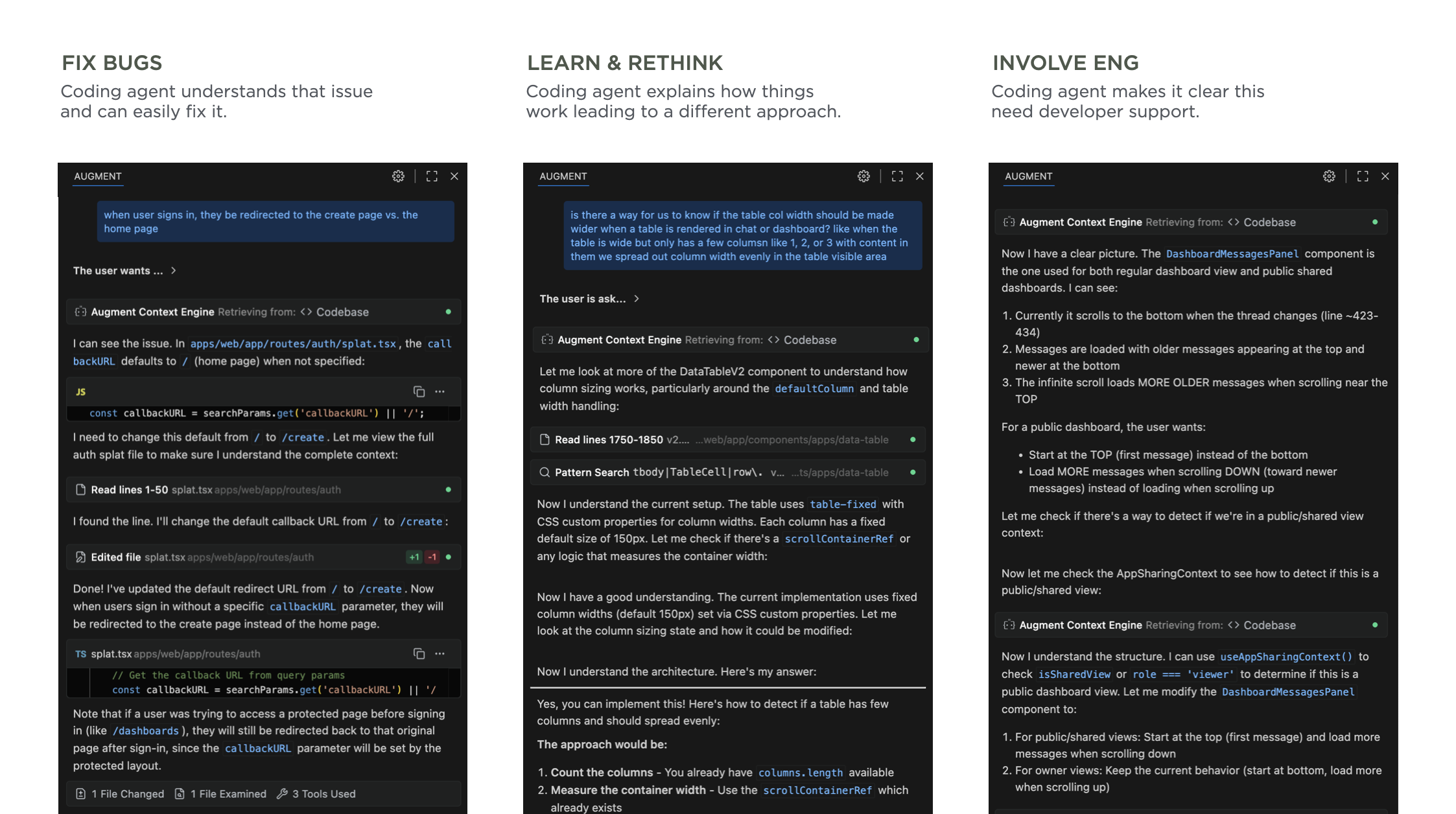
Note: It's worth calling out that for these use cases to work well, you need AI coding tools that deeply understand your company's codebase. I, like the PM mentioned earlier, use Augment Code because their Context Engine is optimized for the kinds of large and complex codebases you'll find in most companies.
Fix Production BugsSee a bug or user experience issue in production? Just prompt the agent with a description of the issue, test its solution, and push a fix. Not only will fixing bugs make you feel great, your engineering friends will appreciate the help. There's always lots of "small" issues that designers know can be improved but can't get development resources for. Now those resources come in the form of AI coding agents.
Learn & Rethink SolutionsSometimes what seems like a small fix or improvement is just the tip of an iceberg. That is, changing something in the product has a fan-out effect. To change this, you also need to change that. That change will also impact these things. And so on.
Watching an AI coding agent go through its thinking process and steps can make all this clear. Even if you don't end up using any of the code it writes, seeing an agent's process teaches you a lot about how a system works. I've ended up rethinking my approach, considering different options and ultimately getting to a better solution than I started with. Thanks AI.
Get Engineering InvolvedPrompting an agent and seeing its process can also make something else clear: it's time to get Engineering involved. When it's obvious the scope of what an AI agent is trying to do to solve an issue or make an improvement is too broad, chances are it's time to sit down with the developers on your team to come up with a plan. This doesn't mean the agent failed, it means it prompted you to collaborate with your team.
Through these use cases, AI coding agents have helped me make more improvements and make more informed improvements to the products I work on. It's a great time to be a designer.
Agentic AI Interface Improvements
Two weeks ago I shared the evolution and thinking behind a new user interface design for agentic AI products. We've continued to iterate on this layout and it's feeling much improved. Here's the latest incarnation.
Today's AI chat interfaces hit usability issues when models engage in extended reasoning and tool use (aka they get more agentic). Instead of simple back-and-forth chat, these conversations look more like long internal monologues filled with thinking traces, tool calls, and multiple responses. This creates UI problems, especially in narrow side panels where people lose context as their initial instructions and subsequent steps are off-screen while the AI continues to work and evaluate its results.
As you can see in the video above, our dual-scroll pane layout addresses these issues by separating an AI model's process and results into two columns. User instructions, thinking traces, and tool calls appear in the left column, while outputs show up in the right column.
Once the AI completes its work, the thinking steps (traces, tool calls) collapse into a summary on the left while results remain persistent and scrollable on the right. This design keeps both instructions and outcomes visible simultaneously even when people move between different instructions. Once done, the collapsed thinking steps can also be re-opened if someone needs to review an AI model's work. Each step in this process list is also a link to its specific result making understanding and checking an AI model's work easier.
You can try out these interactions yourself on ChatDB with an example like this retail site or with your own data.
Thanks to Sam Breed and Alex Godfrey for the continued evolution of this UI.