Tech News
Heart-shaped Books
Read the book, Typographic Firsts
When ancient Egyptians embalmed their dead, organs were removed from the body. The brain, considered useless, was disposed of, while the stomach, liver, intestines, and lungs were preserved separately in boxes or canopic jars. However, the heart, considered the seat of intelligence, was thought to be essential in the afterlife […]
The post Heart-shaped Books appeared first on I Love Typography Ltd.
10 Must-have Typefaces for 2026
Read the book, Typographic Firsts
How quickly a year passes. Our Must-Have Fonts for 2025 list was our most popular ever, but our must-have fonts for 2026 list aims to set the bar even higher. Finding the best typefaces among thousands can be pretty daunting! So, to make things easier, we’ve curated a list of outstanding must-have […]
The post 10 Must-have Typefaces for 2026 appeared first on I Love Typography Ltd.
More on Context Management in AI Products
In AI products, context refers to the content, tools, and instructions provided to a model at any given moment. Because AI models have context limits, what's included (aka what a model is paying attention to) has a massive impact on results. So context management is key to letting people understand and shape what AI products produce.
In Context Management UI in AI Products I looked at UI patterns for showing users what information is influencing AI model responses, from simple context chips to nested agent timelines. This time I want to highlight two examples of automatic and manual context management solutions.
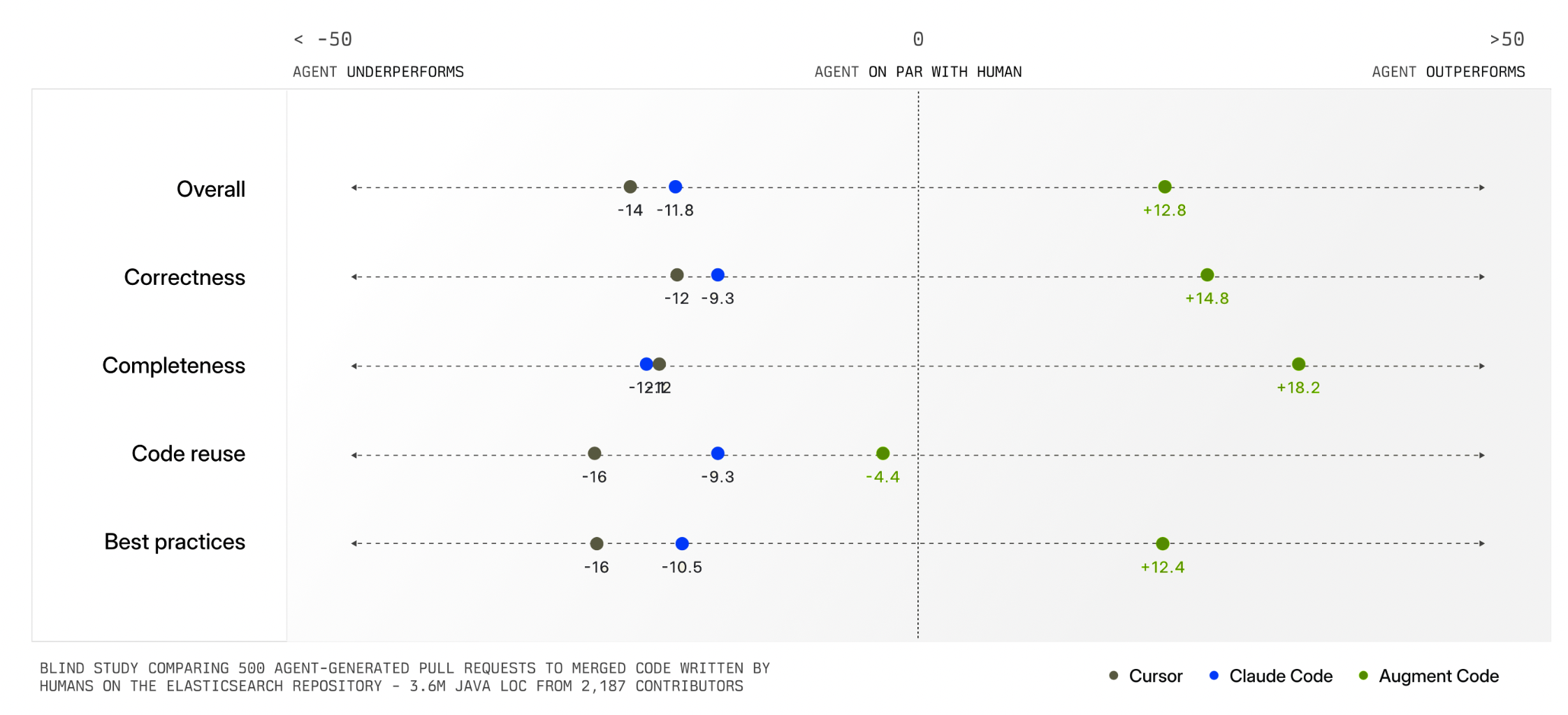
Augment Code's Context Engine demonstrates how automatic context management can dramatically improve AI product outcomes. Their system continuously indexes code commit history (understanding why changes were made), team coding patterns, documentation, and what developers on a team are actively working on.
When a developer asks to "add logging to payment requests," the system identifies exactly which files and patterns are relevant. This means developers don't have to manually specify what the AI should pay attention to. The system figures it out automatically and delivers much higher quality output as a result (see chart below).
Having an intelligent system manage context for you is extremely helpful but not always possible. In many kinds of tasks, there is no clear record of history, current state, and relevance like there is in a company's codebase. Also, some tasks are bespoke or idiosyncratic meaning only the person running them knows what's truly relevant. For these reasons, AI products also need context management interfaces.
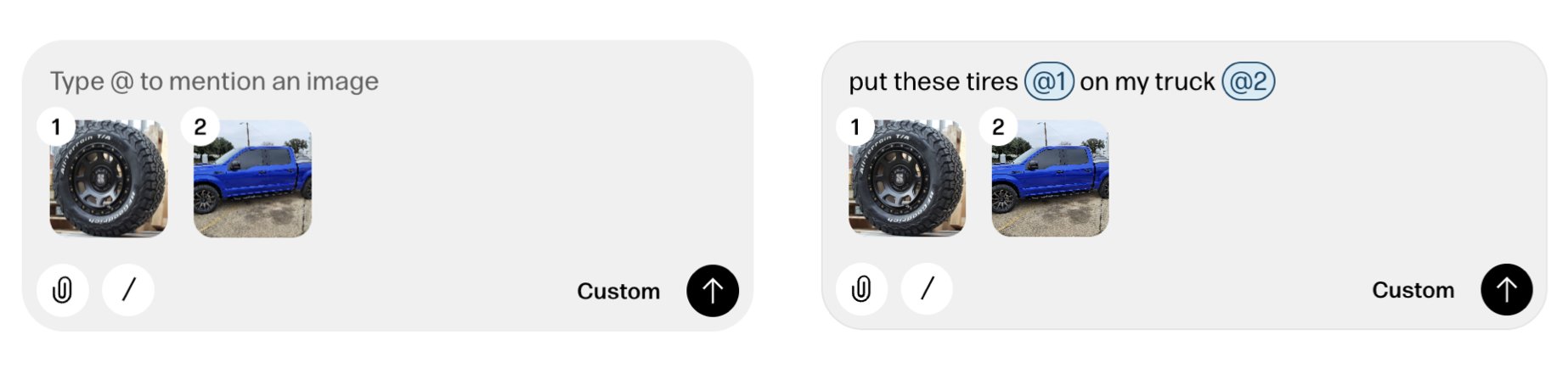
Reve's creative tooling interface not only makes manual context management possible but also provides a consistent way to reference context in instructions as well. When someone adds a file to Reve, a thumbnail of it appears in the instruction field with a numbered reference. People can then use this number when writing out instructions like "put these tires @1 on on my truck @2".
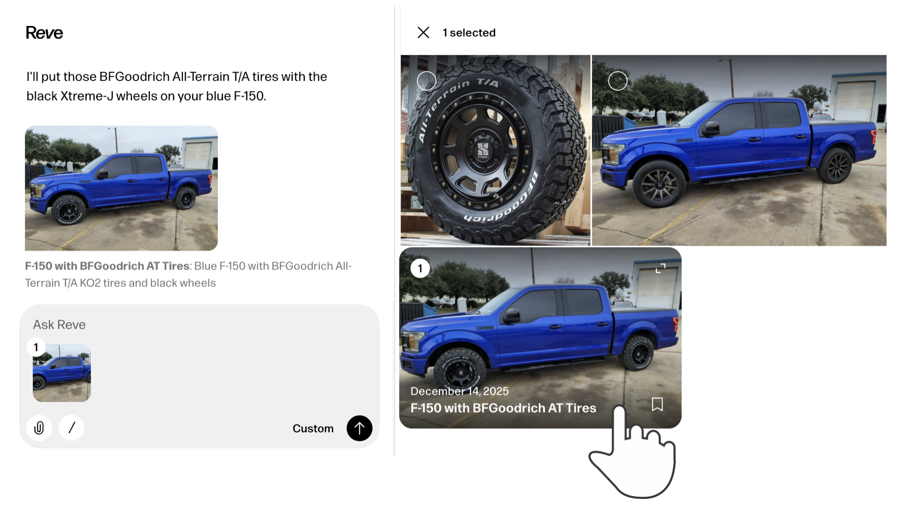
It's also worth noting that any file uploaded to or created by Reve can be put into context with a simple "one-click" action. Just select any image and it will appear in the instruction field with a reference number. Select it again to remove it from context just as easily.
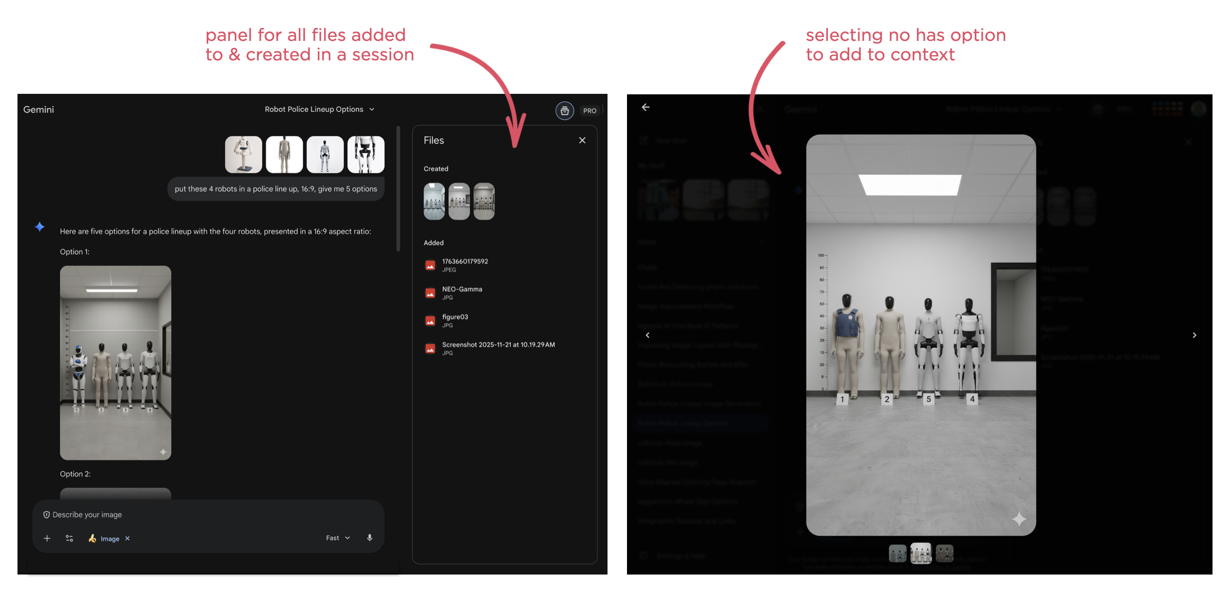
While the later may seem like a clear UI requirement, it's surprising how many AI products don't support this behavior. For instance, Google's Gemini has a nice overview panel of files uploaded to and created in a session but doesn't make them selectable as context.
As usual, AI capabilities keep changing fast. So context management solutions, whether automatic or manual, and their interfaces are going to continue to evolve.
AI Coding Agents for Designers
In an increasing number of technology companies, the majority of code is being written by AI coding agents. While that primarily boosts software developer productivity, they aren't the only ones that can benefit from this transformation. Here's how AI coding agents can also help designers.
As AI coding agents continue to improve dramatically, developers are turning to them more and more to not only write code but to review and improve it as well. The result isn't just more coder faster but the organizational changes needed to support this transition as well.
"The vast majority of code that is used to support Claude and to design the next Claude is now written by Claude. It's just the vast majority of it within Anthropic. And other fast moving companies, the same is true."- Dario Amodei, Anthropic CEO "Codex has transformed how OpenAI builds over the last few months."
- Sam Altman, OpenAI CEO
As just one example, a product manager I speak with regularly now spends his time using Augment Code on his company's production codebase. He creates a branch, prompts Augment's agents until he has a build he's happy with then passes it on to Engineering for implementation. Instead of writing a Product Requirements Document (PRD) he creates code that can be used and experienced by the whole team leading to a clearer understanding of what to build and why.
This kind of accelerated prototyping is a common way for designers to start applying AI coding agents to their workflow as well. But while the tools may be new, prototyping isn't new to designers. In fact, many larger design teams have specific prototyping roles within them. So what additional capabilities do AI coding agents give designers? Here's a few I've been using regularly.
Note: It's worth calling out that for these use cases to work well, you need AI coding tools that deeply understand your company's codebase. I, like the PM mentioned earlier, use Augment Code because their Context Engine is optimized for the kinds of large and complex codebases you'll find in most companies.
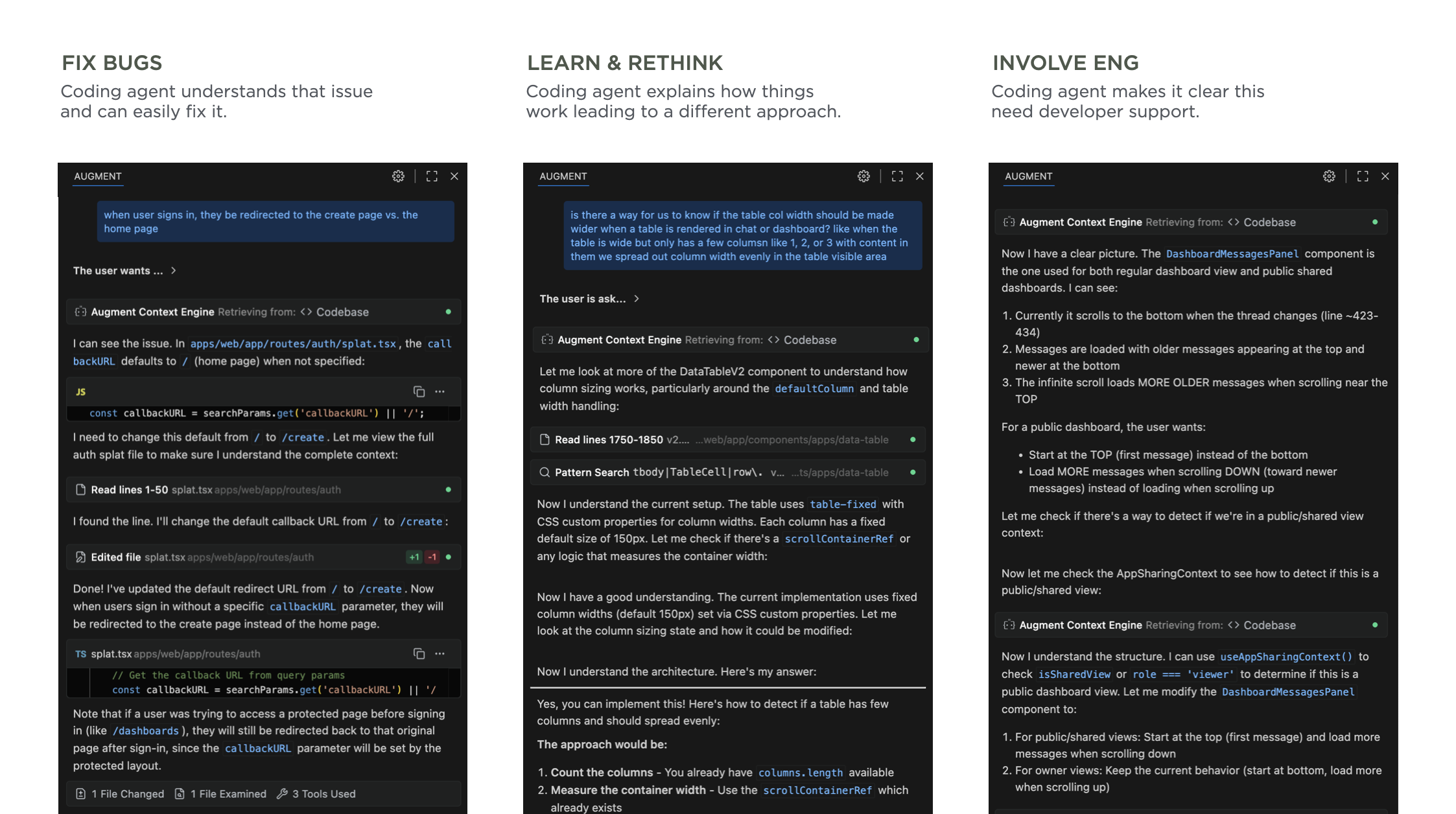
Fix Production BugsSee a bug or user experience issue in production? Just prompt the agent with a description of the issue, test its solution, and push a fix. Not only will fixing bugs make you feel great, your engineering friends will appreciate the help. There's always lots of "small" issues that designers know can be improved but can't get development resources for. Now those resources come in the form of AI coding agents.
Learn & Rethink SolutionsSometimes what seems like a small fix or improvement is just the tip of an iceberg. That is, changing something in the product has a fan-out effect. To change this, you also need to change that. That change will also impact these things. And so on.
Watching an AI coding agent go through its thinking process and steps can make all this clear. Even if you don't end up using any of the code it writes, seeing an agent's process teaches you a lot about how a system works. I've ended up rethinking my approach, considering different options and ultimately getting to a better solution than I started with. Thanks AI.
Get Engineering InvolvedPrompting an agent and seeing its process can also make something else clear: it's time to get Engineering involved. When it's obvious the scope of what an AI agent is trying to do to solve an issue or make an improvement is too broad, chances are it's time to sit down with the developers on your team to come up with a plan. This doesn't mean the agent failed, it means it prompted you to collaborate with your team.
Through these use cases, AI coding agents have helped me make more improvements and make more informed improvements to the products I work on. It's a great time to be a designer.
Steven Heller’s Font of the Year: Fillmore
Read the book, Typographic Firsts
In my past Font of the Month columns, I admitted to extreme fixation for ‘stencilism’ and avaricious hoarding of stencil type and lettering specimens. There is a je ne sais quoi about them that, perhaps, reminds me of some primal life event. I don’t judge stencils on aesthetics per se […]
The post Steven Heller’s Font of the Year: Fillmore appeared first on I Love Typography Ltd.
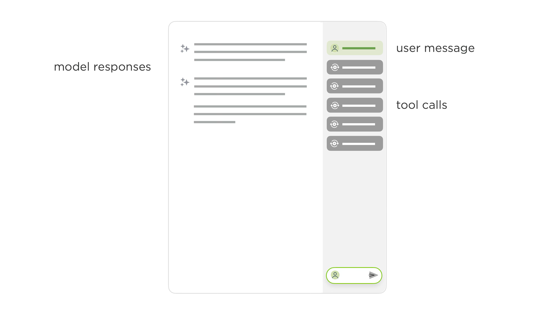
Agentic AI Interface Improvements
Two weeks ago I shared the evolution and thinking behind a new user interface design for agentic AI products. We've continued to iterate on this layout and it's feeling much improved. Here's the latest incarnation.
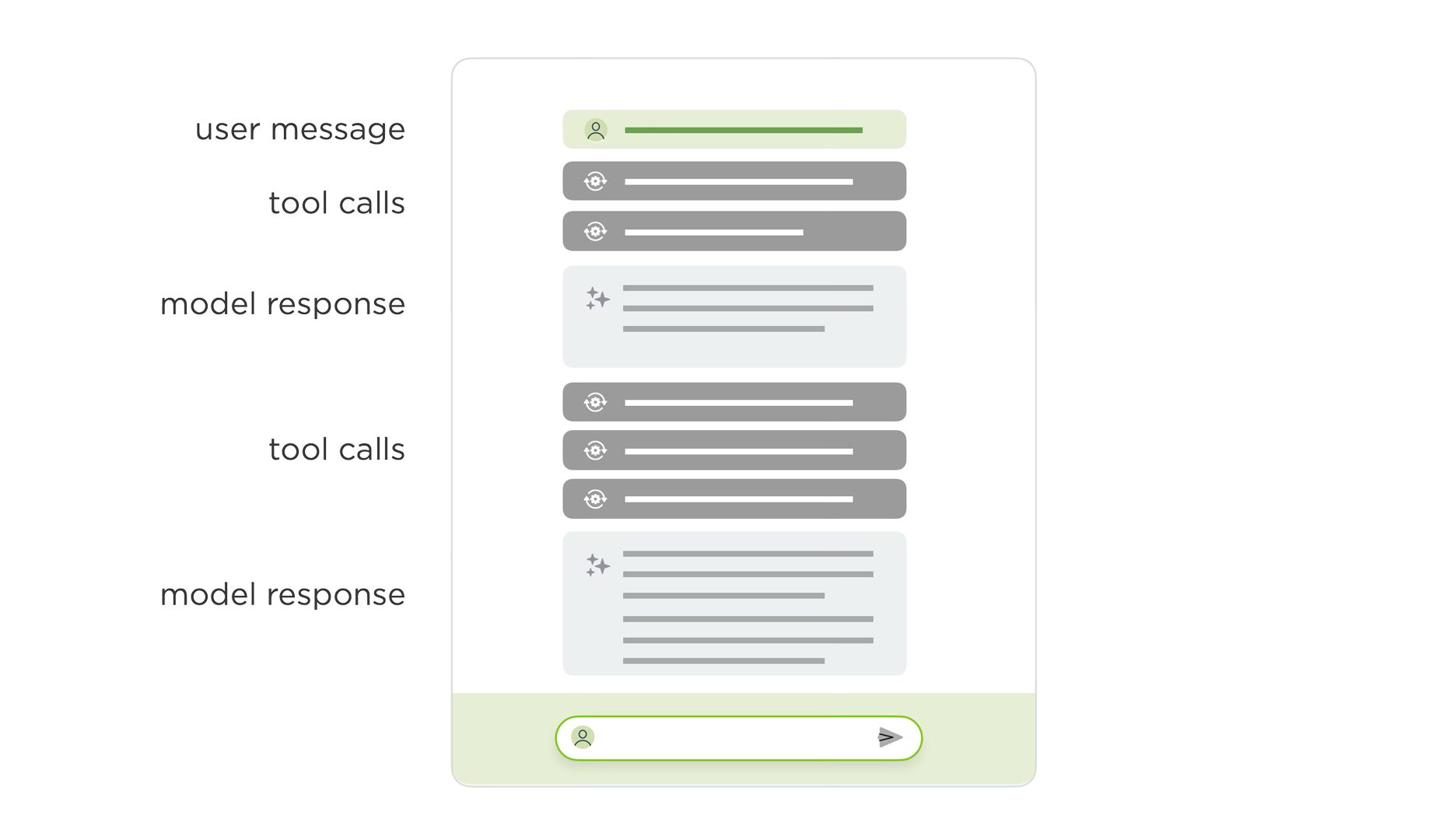
Today's AI chat interfaces hit usability issues when models engage in extended reasoning and tool use (aka they get more agentic). Instead of simple back-and-forth chat, these conversations look more like long internal monologues filled with thinking traces, tool calls, and multiple responses. This creates UI problems, especially in narrow side panels where people lose context as their initial instructions and subsequent steps are off-screen while the AI continues to work and evaluate its results.
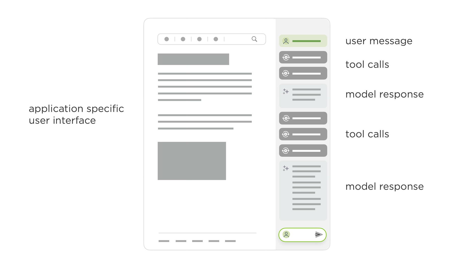
As you can see in the video above, our dual-scroll pane layout addresses these issues by separating an AI model's process and results into two columns. User instructions, thinking traces, and tool calls appear in the left column, while outputs show up in the right column.
Once the AI completes its work, the thinking steps (traces, tool calls) collapse into a summary on the left while results remain persistent and scrollable on the right. This design keeps both instructions and outcomes visible simultaneously even when people move between different instructions. Once done, the collapsed thinking steps can also be re-opened if someone needs to review an AI model's work. Each step in this process list is also a link to its specific result making understanding and checking an AI model's work easier.
You can try out these interactions yourself on ChatDB with an example like this retail site or with your own data.
Thanks to Sam Breed and Alex Godfrey for the continued evolution of this UI.
On Inheriting and Sharing Property Values
Sometimes I want to set the value of a CSS property to that of a different property, even if I don’t know what that value is, and even if it changes later. Unfortunately though, that’s not possible (at least, there isn’t a CSS function that specifically does that).
In my opinion, it’d be super useful to have something like this (for interpolation, maybe you’d throw calc-size() in there as well):
/* Totally hypothetical */ button { border-radius: compute(height, self); border-radius: compute(height, inherit); border-radius: compute(height, #this); }In 2021, Lea Verou explained why, despite being proposed numerous times, implementing such a general-purpose CSS function like this isn’t feasible. Having said that, I do remain hopeful, because things are always evolving and the CSSWG process isn’t always linear.
In the meantime, even though there isn’t a CSS function that enables us to get the value of a different property, you might be able to achieve your outcome using a different method, and those methods are what we’re going to look at today.
The fool-proof CSS custom properties methodWe can easily get the value of a different CSS property using custom properties, but we’d need to know what the value is in order to declare the custom property to begin with. This isn’t ideal, but it does enable us to achieve some outcomes.
Let’s jump back to the example from the intro where we try to set the border-radius based on the height, only this time we know what the height is and we store it as a CSS custom property for reusability, and so we’re able to achieve our outcome:
button { --button-height: 3rem; height: var(--button-height); border-radius: calc(var(--button-height) * 0.3); }We can even place that --button-height custom property higher up in the CSS cascade to make it available to more containment contexts.
:root { /* Declare here to use anywhere */ --button-height: 3rem; header { --header-padding: 1rem; padding: var(--header-padding); /* Height is unknown (but we can calculate it) */ --header-height: calc(var(--button-height) + (var(--header-padding) * 2)); /* Which means we can calculate this, too */ border-radius: calc(var(--header-height) * 0.3); button { /* As well as these, of course */ height: var(--button-height); border-radius: calc(var(--button-height) * 0.3); /* Oh, what the heck */ padding-inline: calc(var(--button-height) * 0.5); } } } CodePen Embed FallbackI guess when my math teacher said that I’d need algebra one day. She wasn’t lying!
The unsupported inherit() CSS function methodThe inherit() CSS function, which isn’t currently supported by any web browser, will enable us to get the value of a parent’s property. Think: the inherit keyword, except that we can get the value of any parent property and even modify it using value functions such as calc(). The latest draft of the CSS Values and Units Module Level 5 spec defines how this’d work for custom properties, which wouldn’t really enable us to do anything that we can’t already do (as demonstrated in the previous example), but the hope is that it’d work for all CSS properties further down the line so that we wouldn’t need to use custom properties (which is just a tad longer):
header { height: 3rem; button { height: 100%; /* Get height of parent but use it here */ border-radius: calc(inherit(height) * 0.3); padding-inline: calc(inherit(height) * 0.5); } }There is one difference between this and the custom properties approach, though. This method depends on the fixed height of the parent, whereas with the custom properties method either the parent or the child can have the fixed height.
This means that inherit() wouldn’t interpolate values. For example, an auto value that computes to 3rem would still be inherited as auto, which might compute to something else when inherit()-ed., Sometimes that’d be fine, but other times it’d be an issue. Personally, I’m hoping that interpolation becomes a possibility at some point, making it far more useful than the custom properties method.
Until then, there are some other (mostly property-specific) options.
The aspect-ratio CSS propertyUsing the aspect-ratio CSS property, we can set the height relative to the width, and vice-versa. For example:
div { width: 30rem; /* height will be half of the width */ aspect-ratio: 2 / 1; /* Same thing */ aspect-ratio: 3 / 1.5; /* Same thing */ aspect-ratio: 10 / 5; /* width and height will be the same */ aspect-ratio: 1 / 1; }Technically we don’t “get” the width or the height, but we do get to set one based on the other, which is the important thing (and since it’s a ratio, you don’t need to know the actual value — or unit — of either).
The currentColor CSS keywordThe currentColor CSS keyword resolves to the computed value of the color property. Its data type is <color>, so we can use it in place of any <color> on any property on the same element. For example, if we set the color to red (or something that resolves to red), or if the color is computed as red via inheritance, we could then declare border-color: currentColor to make the border red too:
body { /* We can set color here (and let it be inherited) */ color: red; button { /* Or set it here */ color: red; /* And then use currentColor here */ border-color: currentColor; border: 0.0625rem solid currentColor; background: hsl(from currentColor h s 90); } } CodePen Embed FallbackThis enables us to reuse the color without having to set up custom properties, and of course if the value of color changes, currentColor will automatically update to match it.
While this isn’t the same thing as being able to get the color of literally anything, it’s still pretty useful. Actually, if something akin to compute(background-color) just isn’t possible, I’d be happy with more CSS keywords like currentColor.
In fact, currentBackgroundColor/currentBackground has already been proposed. Using currentBackgroundColor for example, we could set the border color to be slightly darker than the background color (border-color: hsl(from currentBackgroundColor h s calc(l - 30))), or mix the background color with another color and then use that as the border color (border-color: color-mix(currentBackgroundColor, black, 30)).
But why stop there? Why not currentWidth, currentHeight, and so on?
The from-font CSS keywordThe from-font CSS keyword is exclusive to the text-decoration-thickness property, which can be used to set the thickness of underlines. If you’ve ever hated the fact that underlines are always 1px regardless of the font-size and font-weight, then text-decoration-thickness can fix that.
The from-font keyword doesn’t generate a value though — it’s optionally provided by the font maker and embedded into the font file, so you might not like the value that they provide, if they provide one at all. If they don’t, auto will be used as a fallback, which web browsers resolve to 1px. This is fine if you aren’t picky, but it’s nonetheless unreliable (and obviously quite niche).
We can, however, specify a percentage value instead, which will ensure that the thickness is relative to the font-size. So, if text-decoration-thickness: from-font just isn’t cutting it, then we have that as a backup (something between 8% and 12% should do it).
Don’t underestimate CSS unitsYou probably already know about vw and vh units (viewport width and viewport height units). These represent a percentage of the viewport’s width and height respectively, so 1vw for example would be 1% of the viewport’s width. These units can be useful by themselves or within a calc() function, and used within any property that accepts a <length> unit.
However, there are plenty of other, lesser-known units that can be useful in a similar way:
- 1ex: equal to the computed x-height
- 1cap: equal to the computed cap height
- 1ch: equal to the computed width of the 0 glyph
- 1lh: equal to the computed line-height (as long as you’re not trimming or adding to its content box, for example using text-box or padding, respectively, lh units could be used to determine the height of a box that has a fixed number of lines)
And again, you can use them, their logical variants (e.g., vi and vb), and their root variants (e.g., rex and rcap) within any property that accepts a <length> unit.
In addition, if you’re using container size queries, you’re also free to use the following container query units within the containment contexts:
- 1cqw: equal to 1% of the container’s computed width
- 1cqh: equal to 1% of the container’s computed height
- 1cqi: equal to 1% of the container’s computed inline size
- 1cqb: equal to 1% of the container’s computed block size
- 1cqmin: equal to 1cqi or 1cqb, whichever is smallest
- 1cqmax: equal to 1cqi or 1cqb, whichever is largest
That inherit() example from earlier, you know, the one that isn’t currently supported by any web browser? Here’s the same thing but with container size queries:
header { height: 3rem; container: header / size; @container header (width) { button { height: 100%; border-radius: calc(100cqh * 0.3); padding-inline: calc(100cqh * 0.5); } } } CodePen Embed FallbackOr, since we’re talking about a container and its direct child, we can use the following shorter version that doesn’t create and query a named container (we don’t need to query the container anyway, since all we’re doing is stealing its units!):
header { height: 3rem; container-type: size; button { height: 100%; border-radius: calc(100cqh * 0.3); padding-inline: calc(100cqh * 0.5); } }However, keep in mind that inherit() would enable us to inherit anything, whereas container size queries only enable us to inherit sizes. Also, container size queries don’t work with inline containers (that’s why this version of the container is horizontally stretched), so they can’t solve every problem anyway.
In a nutshellI’m just going to throw compute() out there again, because I think it’d be a really great way to get the values of other CSS properties:
button { /* self could be the default */ border-radius: compute(height, self); /* inherit could work like inherit() */ border-radius: compute(height, inherit); /* Nice to have, but not as important */ border-radius: compute(height, #this); }But if it’s just not possible, I really like the idea of introducing more currentColor-like keywords. With the exception of keywords like from-font where the font maker provides the value (or not, sigh), keywords such as currentWidth and currentHeight would be incredibly useful. They’d make CSS easier to read, and we wouldn’t have to create as many custom properties.
In the meantime though, custom properties, aspect-ratio, and certain CSS units can help us in the right circumstances, not to mention that we’ll be getting inherit() in the future. These are heavily geared towards getting widths and heights, which is fine because that’s undoubtedly the biggest problem here, but hopefully there are more CSS features on the horizon that allow values to be used in more places.
On Inheriting and Sharing Property Values originally published on CSS-Tricks, which is part of the DigitalOcean family. You should get the newsletter.
Sketch: A guided tour of Copenhagen
Sketch is getting a massive UI overhaul, codenamed Copenhagen:
Our latest update — Copenhagen — features a major redesign of Sketch’s UI. Redesigns like this don’t happen often. In fact, our last one was in 2020, when Apple launched macOS Big Sur.
Makes a lot of sense for an app that’s so tightly integrated to Mac to design around the macOS UI. Big Sur was a big update. Apple called it the biggest one since Mac OS X. So big, indeed, that they renamed Mac OS to macOS in the process. Now we have macOS Tahoe and while it isn’t billed the “biggest update since Big Sur” it does lean into an entirely new Liquid Glass aesthetic that many are calling the biggest design update to the Apple ecosystem since iOS 7.
Sketch probably didn’t “have” to redesign its UI to line up with macOS Tahoe, but a big part of its appeal is the fact that it feels like it totally belongs to the Mac. It’s the same for Panic apps.
The blog post I linked to sheds a good amount of light on the Sketch team’s approach to the updates. I came to the blog post to read about the attention they put into new features (individual page and frame link for the win!) and tightening up existing ones (that layer list looks nice), but what I really stayed for was their approach to Liquid Glass. Turns out they decided to respect it, but split lanes a bit:
Early on in the process, we prototyped various approaches to the sidebar and Inspector, including floating options (the new default in Tahoe) and glass materials. Ultimately, we went custom here, with fixed sidebars that felt less distracting in the context of a canvas-based design tool.
Spend a few seconds with an early prototype that leaned more heavily into Liquid Glass and it’s uber clear why a custom route was the best lane choice:
Still taken from one of the blog post’s embedded videosChoosing a design editor can feel personal, can’t it? I know lots of folks are in the Figma Or Bust camp. Illustrator is still the favorite child for many, after all these… decades! There’s a lot of buzz around Affinity now that it’s totally free. I adopted Sketch a long time ago. How long? I dug up this dusty old blog post I wrote about Sketch 3 back in 2014, so at least 11 years.
But I’m more of a transient in the design editor space. Being a contractor and all, I have to be open to any app my clients might use internally, regardless of my personal preference. I’d brush up on Sketch’s UI updates even if it wasn’t my go-to.
Sketch: A guided tour of Copenhagen originally published on CSS-Tricks, which is part of the DigitalOcean family. You should get the newsletter.
Should We Even Have :closed?
For the past few months, I’ve been writing a lot of entries on pseudo-selectors in CSS, like ::picker() or ::checkmark. And, in the process, I noticed I tend to use the :open pseudo-selector a lot in my examples — and in my work in general.
Borrowing words from the fine author of the :open entry in the Almanac:
The CSS :open pseudo-selector targets elements that support open and closed states — such as the <details> and <select> elements — and selects them in their open state.
So, given this:
details:open { background: lightblue; color: darkred; }We expect that the <details> element gets a light blue background and dark red text when it is in an open state (everywhere but Safari at the time I’m writing this):
CodePen Embed FallbackBut what if we want to select the “closed” state instead? That’s what we have the:closed pseudo-class for, right? It’s supposed to match an element’s closed state. I say, supposed because it’s not specced yet.
But does it need to be specced at all? I only ask because we can still target an element’s closed state without it using :not():
/* When details is _not_ open, but closed */ details:not(:open) { /* ... */ }So, again: do we really need a :closed pseudo-class? The answer may surprise you! (Just kidding, this isn’t that sort of article…)
Some backgroundTalks surrounding :open started in May 2022 when Mason Freed raised the issue of adding :open (which was also considered being named :top-layer at the time) to target elements in the top layer (like popups):
Today, the OpenUI WC similarly resolved to add a :top-layer pseudo class that should apply to (at least) elements using the Popup API which are currently in the top layer. The intention for the naming and behavior, though, was that this pseudo class should also be general purpose. It should match any type of element in the top layer, including modal <dialog>, fullscreen elements, and ::backdrop pseudo elements.
This sparked discourse on whether the name of the pseudo-element targeting the top layer of any type of element (e.g., popups, pickers, etc.) should either be :open or :top-layer. I, for one, was thrilled when the CSSWG eventually decided on :open in August 2022. The name makes a lot more sense to me because “open” assumes something in the top layer.
To :close or :not(:open)?Hold on, though! In September that same year, Mason asked whether or not we should have something like a :closed pseudo-class to accompany :open. That way, we can match elements in their “closed” states just as we can their “open” states. That makes a lot of sense, t least on the surface. Tab Atkins chimed in:
I love this definition, as I think it captures a concept of “openness” that lines up with what most developers think “open” means. I also think it makes it relatively straightforward for HTML to connect it to specific elements.
What do folks think?
Should we also talk about adding the corresponding :closed pseudo class? That would avoid the problem that :not(:open) can match anything, including things that don’t open or close.
And guess what? Everyone seemed to agree. Why? Because it made sense at the time. I mean, since we have a pseudo-class that targets elements in their :open state, surely it makes sense to have :closed to target elements in their closed states, right? Right??
No. There’s actually an issue with that line of reasoning. Joey Arhar made a comment about it in October that same year:
I opened a new issue about :closed because this doesn’t have consensus yet (#11039).
Wait, what happened to consensus? It’s the same question I raised at the top of this post. According to Luke Warlow:
Making :closed match things that can never be open feels odd. And would essentially make it :not(:open) in which case do we even need :closed? Like we don’t have a :popover-closed because it’s the inverse of :popover-open.
There is no :closed… for nowFast forward one more month to November 2024. A consensus was made to start out with just :open and remove :closed for the time being.
Dang. Nevertheless, according to WHATWG and CSSWG, that decision could change in the future. In fact, Bramus dropped a useful note in there just a month before WHATWG made the decision:
Just dropping this as an FYI: :read-only is defined as :not(:read-write), and that shipped.
Which do you find easier to understand?Personally, I’m okay with :closed — or even using :not(:open) — so far as it works. In fact, I went ahead swapped :closed for :not(:open) in my ::checkmark and ::picker() examples. That’s why they are they way they are today.
But! If you were to ask me which one comes easier to me on a typical day, I think I would say :closed. It’s easier for me to think in literal terms than negated statements.
What do you think, though? Would you prefer having :closed or just leaving it as :not(:open)?
If you’re like me and you love following discussions like this, you can always head over to CSSWG drafts on GitHub to watch or participate in the fun.
Should We Even Have :closed? originally published on CSS-Tricks, which is part of the DigitalOcean family. You should get the newsletter.
Dumb Ways to Die: Printed Ephemera
Read the book, Typographic Firsts
Dumb Ways to Die began as an Australian rail safety campaign back in 2012. I heard the viral jingle recently, and it got me to thinking about a particular kind of printed ephemera. From about 1530, London began to publish Bills of Mortality. By the close of the same century, these lists […]
The post Dumb Ways to Die: Printed Ephemera appeared first on I Love Typography Ltd.
Quiet UI Came and Went, Quiet as a Mouse
A few weeks ago, Quiet UI made the rounds when it was released as an open source user interface library, built with JavaScript web components. I had the opportunity to check out the documentation and it seemed like a solid library. I’m always super excited to see more options for web components out in the wild.
Unfortunately, before we even had a chance to cover it here at CSS-Tricks, Quiet UI has disappeared. When visiting the Quiet UI website, there is a simple statement:
UnavailableQuiet UI is no longer available to the general public. I will continue to maintain it as my personal creative outlet, but I am unable to release it to the world at this time.
Thanks for understanding. I’m really sorry for the inconvenience.
The repository for Quiet UI is no longer available on Quiet UI’s GitHub, and its social accounts seem to have been removed as well.
The creator, Cory LaViska, is a veteran of UI libraries and most known for work on Shoelace. Shoelace joined Font Awesome in 2022 and was rebranded as Web Awesome. The latest version of Web Awesome was released around the same time Quiet UI was originally announced.
According to the Quiet UI site, Cory will be continuing to work on it as a personal creative outlet, but hopefully we’ll be able to see what he’s cooking up again, someday. In the meantime, you can get a really good taste of what the project is/was all about in Dave Rupert’s fantastic write-up.
Quiet UI Came and Went, Quiet as a Mouse originally published on CSS-Tricks, which is part of the DigitalOcean family. You should get the newsletter.
The Range Syntax Has Come to Container Style Queries and if()
The range syntax isn’t a new thing. We‘re already able to use it with media queries to query viewport dimensions and resolutions, as well as container size queries to query container dimensions. Being able to use it with container style queries — which we can do starting with Chrome 142 — means that we can compare literal numeric values as well as numeric values tokenized by custom properties or the attr() function.
In addition, this feature comes to the if() function as well.
Here’s a quick demo that shows the range syntax being used in both contexts to compare a custom property (--lightness) to a literal value (50%):
#container { /* Choose any value 0-100% */ --lightness: 10%; /* Applies it to the background */ background: hsl(270 100% var(--lightness)); color: if( /* If --lightness is less than 50%, white text */ style(--lightness < 50%): white; /* If --lightness is more than or equal to 50%, black text */ style(--lightness >= 50%): black ); /* Selects the children */ * { /* Specifically queries parents */ @container style(--lightness < 50%) { color: white; } @container style(--lightness >= 50%) { color: black; } } }Again, you’ll want Chrome 142 or higher to see this work:
CodePen Embed FallbackBoth methods do the same thing but in slightly different ways.
Let’s take a closer look.
Range syntax with custom propertiesIn the next demo coming up, I’ve cut out the if() stuff, leaving only the container style queries. What’s happening here is that we’ve created a custom property called --lightness on the #container. Querying the value of an ordinary property isn’t possible, so instead we save it (or a part of it) as a custom property, and then use it to form the HSL-formatted value of the background.
#container { /* Choose any value 0-100% */ --lightness: 10%; /* Applies it to the background */ background: hsl(270 100% var(--lightness)); }After that we select the container’s children and conditionally declare their color using container style queries. Specifically, if the --lightness property of #container (and, by extension, the background) is less than 50%, we set the color to white. Or, if it’s more than or equal to 50%, we set the color to black.
#container { /* etc. */ /* Selects the children */ * { /* Specifically queries parents */ @container style(--lightness < 50%) { color: white; } @container style(--lightness >= 50%) { color: black; } } } CodePen Embed Fallback/explanation Note that we wouldn’t be able to move the @container at-rules to the #container block, because then we’d be querying --lightness on the container of #container (where it doesn’t exist) and then beyond (where it also doesn’t exist).
Prior to the range syntax coming to container style queries, we could only query specific values, so the range syntax makes container style queries much more useful.
By contrast, the if()-based declaration would work in either block:
#container { --lightness: 10%; background: hsl(270 100% var(--lightness)); /* --lightness works here */ color: if( style(--lightness < 50%): white; style(--lightness >= 50%): black ); * { /* And here! */ color: if( style(--lightness < 50%): white; style(--lightness >= 50%): black ); } } CodePen Embed FallbackSo, given that container style queries only look up the cascade (whereas if() also looks for custom properties declared within the same CSS rule) why use container style queries at all? Well, personal preference aside, container queries allow us to define a specific containment context using the container-name CSS property:
#container { --lightness: 10%; background: hsl(270 100% var(--lightness)); /* Define a named containment context */ container-name: myContainer; * { /* Specify the name here */ @container myContainer style(--lightness < 50%) { color: white; } @container myContainer style(--lightness >= 50%) { color: black; } } }With this version, if the @container at-rule can’t find --lightness on myContainer, the block doesn’t run. If we wanted @container to look further up the cascade, we’d only need to declare container-name: myContainer further up the cascade. The if() function doesn’t allow for this, but container queries allow us to control the scope.
Range syntax with the attr() CSS functionWe can also pull values from HTML attributes using the attr() CSS function.
In the HTML below, I’ve created an element with a data attribute called data-notifs whose value represents the number of unread notifications that a user has:
<div data-notifs="8"></div>We want to select [data-notifs]::after so that we can place the number inside [data-notifs] using the content CSS property. In turn, this is where we’ll put the @container at-rules, with [data-notifs] serving as the container. I’ve also included a height and matching border-radius for styling:
[data-notifs]::after { height: 1.25rem; border-radius: 1.25rem; /* Container style queries here */ }Now for the container style query logic. In the first one, it’s fairly obvious that if the notification count is 1-2 digits (or, as it’s expressed in the query, less than or equal to 99), then content: attr(data-notifs) inserts the number from the data-notifs attribute while aspect-ratio: 1 / 1 ensures that the width matches the height, forming a circular notification badge.
In the second query, which matches if the number is more than 99, we switch to content: "99+" because I don’t think that a notification badge could handle four digits. We also include some inline padding instead of a width, since not even three characters can fit into the circle.
To summarize, we’re basically using this container style query logic to determine both content and style, which is really cool:
[data-notifs]::after { height: 1.25rem; border-radius: 1.25rem; /* If notification count is 1-2 digits */ @container style(attr(data-notifs type(<number>)) <= 99) { /* Display count */ content: attr(data-notifs); /* Make width equal the height */ aspect-ratio: 1 / 1; } /* If notification count is 3 or more digits */ @container style(attr(data-notifs type(<number>)) > 99) { /* After 99, simply say "99+" */ content: "99+"; /* Instead of width, a little padding */ padding-inline: 0.1875rem; } } CodePen Embed FallbackBut you’re likely wondering why, when we read the value in the container style queries, it’s written as attr(data-notifs type(<number>) instead of attr(data-notifs). Well, the reason is that when we don’t specify a data type (or unit, you can read all about the recent changes to attr() here), the value is parsed as a string. This is fine when we’re outputting the value with content: attr(data-notifs), but when we’re comparing it to 99, we must parse it as a number (although type(<integer>) would also work).
In fact, all range syntax comparatives must be of the same data type (although they don’t have to use the same units). Supported data types include <length>, <number>, <percentage>, <angle>, <time>, <frequency>, and <resolution>. In the earlier example, we could actually express the lightness without units since the modern hsl() syntax supports that, but we’d have to be consistent with it and ensure that all comparatives are unit-less too:
#container { /* 10, not 10% */ --lightness: 10; background: hsl(270 100 var(--lightness)); color: if( /* 50, not 50% */ style(--lightness < 50): white; style(--lightness >= 50): black ); * { /* 50, not 50% */ @container style(--lightness < 50) { color: white; } @container style(--lightness >= 50) { color: black; } } }Note: This notification count example doesn’t lend itself well to if(), as you’d need to include the logic for every relevant CSS property, but it is possible and would use the same logic.
Range syntax with literal valuesWe can also compare literal values, for example, 1em to 32px. Yes, they’re different units, but remember, they only have to be the same data type and these are both valid CSS <length>s.
In the next example, we set the font-size of the <h1> element to 31px. The <span> inherits this font-size, and since 1em is equal to the font-size of the parent, 1em in the scope of <span> is also 31px. With me so far?
According to the if() logic, if 1em is equal to less than 32px, the font-weight is smaller (to be exaggerative, let’s say 100), whereas if 1em is equal to or greater than 32px, we set the font-weight to a chunky 900. If we remove the font-size declaration, then 1em computes to the user agent default of 32px, and neither condition matches, leaving the font-weight to also compute to the user agent default, which for all headings is 700.
Basically, the idea is that if we mess with the default font-size of the <h1>, then we declare an optimized font-weight to maintain readability, preventing small-fat and large-thin text.
<h1> <span>Heading 1</span> </h1> h1 { /* The default value is 32px, but we overwrite it to 31px, causing the first if() condition to match */ font-size: 31px; span { /* Here, 1em is equal to 31px */ font-weight: if( style(1em < 32px): 100; style(1em > 32px): 900 ); } } CodePen Embed Fallback CSS queries have come a long way, haven’t they?In my opinion, the range syntax coming to container style queries and the if() function represents CSS’s biggest leap in terms of conditional logic, especially considering that it can be combined with media queries, feature queries, and other types of container queries (remember to declare container-type if combining with container size queries). In fact, now would be a great time to freshen up on queries, so as a little parting gift, here are some links for further reading:
The Range Syntax Has Come to Container Style Queries and if() originally published on CSS-Tricks, which is part of the DigitalOcean family. You should get the newsletter.
ILT Blog Redesign
Read the book, Typographic Firsts
Launched in 2007, the ILT blog is now 18 years old. It was last redesigned in 2015. A lot has happened in that decade, including the launch of our Font Store, ILT Academy, and ILT Trust. The main problem with the existing homepage was that, besides the most recent posts, […]
The post ILT Blog Redesign appeared first on I Love Typography Ltd.
An Alternative Chat UI Layout
Nowadays it seems like every software application is adding an AI chat feature. Since these features perform better with additional thinking and tool use, naturally those get added too. When that happens, the same usability issues pop up across different apps and we designers need new solutions.
Chat is a pretty simple and widely understood interface pattern... so what's the problem? Well when it's just two people talking in a messaging app, things are easy. But when an AI model is on the other side of the conversation and it's full of reasoning traces and tool calls (aka it's agentic), chat isn't so simple anymore.
Instead of "you ask something and the AI model responds", the patterns looks more like:
- You ask something
- The model responds with it's thinking
- It calls a tool and shows you the outcome
- It tells you what it thinks about the outcome
- It calls another tool ...
While these kinds of agentic loops dramatically increase the capabilities of AI models, they look a lot more like a long internal monologue than a back and forth conversation between two people. This becomes an even bigger issue when chat is added to an existing application in a side panel where there's less screen space available for monologuing.
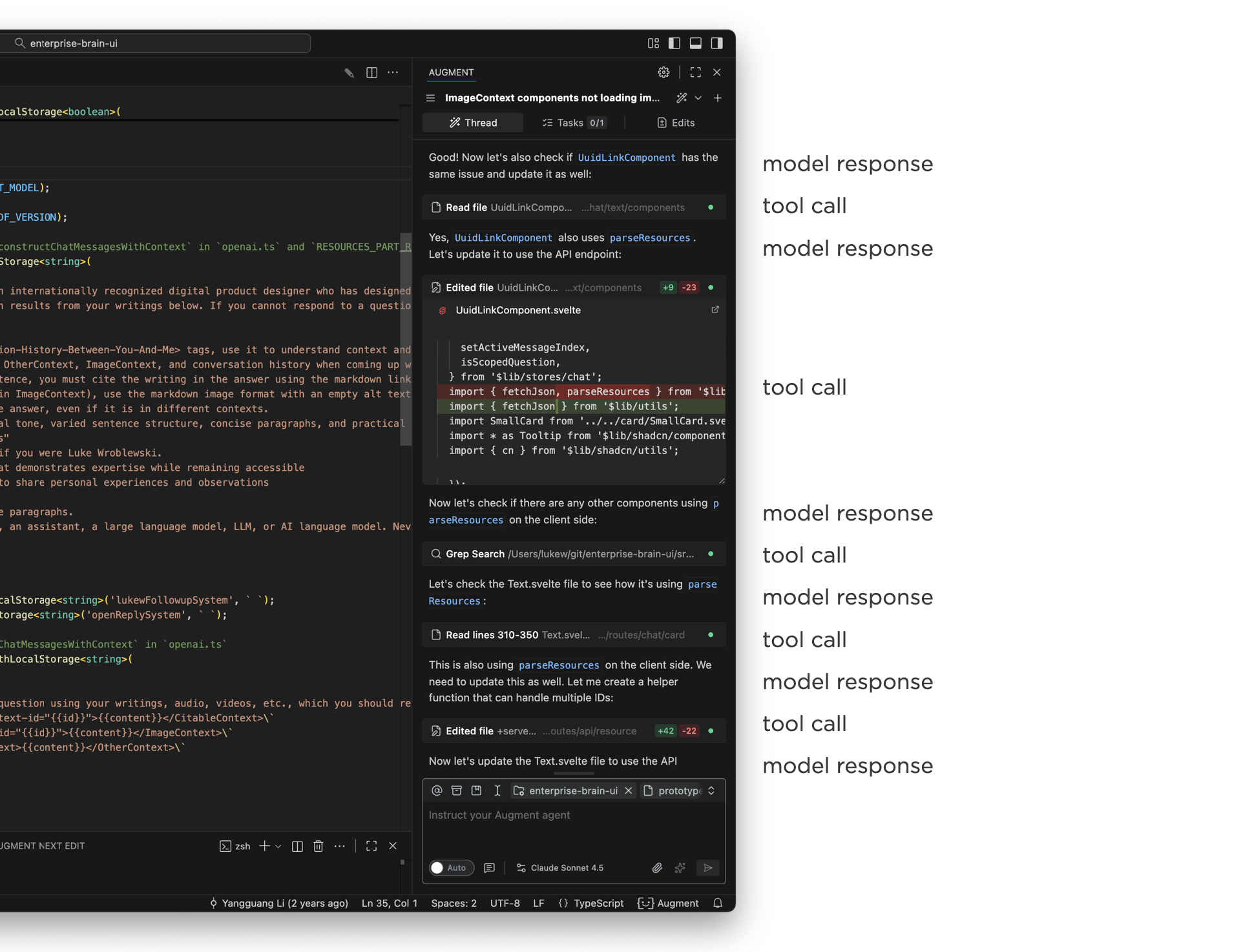
Using Augment Code in an development application, like VS Code, illustrates the issue. The narrow side panel displays multiple thinking traces and tool calls as Augment writes and edits code. The work it's doing is awesome, staying on top of it in a narrow panel is not. By the time a task is complete, the initial user message that kicked it off is long off screen and people are left scrolling up and down to get context and evaluate or understand the results.
That this point design teams start trying to sort out how much of the model's internal monologue needs to be shown in the UI or can parts of it be removed or collapsed? You'll find different answers when looking at different apps. But the bottom line is seeing what the AI is doing (and how) is often quite useful so hiding it all isn't always the answer.
What if we could separate out the process (thinking traces, tool calls) AI models use to do something from their final results? This is effectively the essence of the chat + canvas design pattern. The process lives in one place and the results live somewhere else. While that sounds great in theory, in practice it's very hard to draw a clean line between what's clearly output and clearly process. How "final" does the output need to be before it's considered "the result"? What about follow-on questions? Intermediate steps?
Even if you could separate process and results cleanly, you'd end up with just that: the process visually separated from the results. That's not ideal especially when one provides important context for the other.
To account for all this and more, we've been exploring a new layout for AI chat interfaces with two scroll panes. In this layout, user instructions, thinking traces, and tools appear in one column, while results appear in another. Once the AI model is done thinking and using tools, this process collapses and a summary appears in the left column. The results stay persistent but scrollable in the right column.
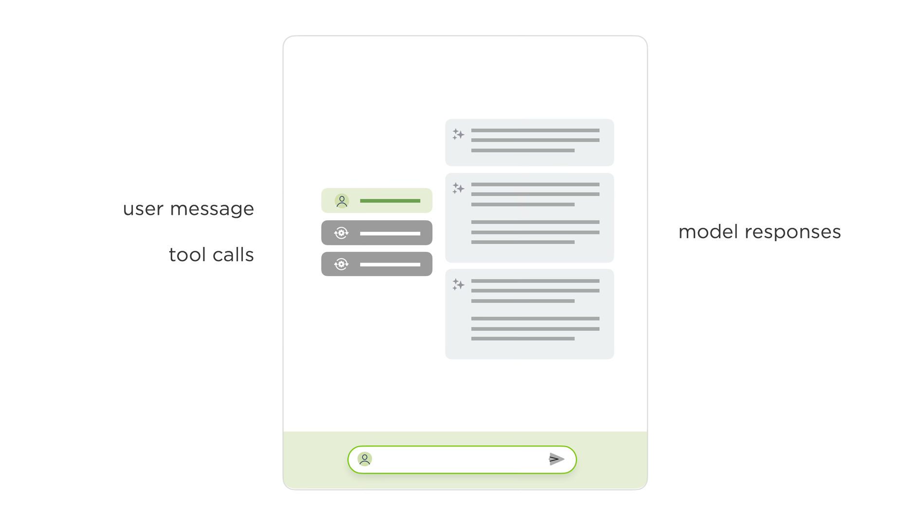
To illustrate the difference, here's the previous agentic chat interface in ChatDB (video below). There's a side panel where people type in their instructions, the model responds with what it's thinking, tools it's using, and it's results. Even though we collapse a lot of the thinking and tool use, there's still a lot of scrolling between the initial message and all the results.
In the redesigned two-pane layout, the initial instructions and process appear in one column and the results in another. This allows people to keep both in context. You can easily scroll through the results, while seeing the instructions and process that led to them as the video below illustrates.
Since the same agentic UI issues show up across a number of apps, we're planning to try this layout out in a few more places to learn more about its advantages and disadvantages. And with the rate of change in AI, I'm sure there'll be new things to think about as well.
Headings: Semantics, Fluidity, and Styling — Oh My!
A few links about headings that I’ve had stored under my top hat.
“Page headings don’t belong in the header”I’ll start with where the <h1> should be placed, and you’ll start to see why the <header> isn’t the right location: it’s the header for the page, and the main page content should live within the <main> element.
A classic conundrum! I’ve seen the main page heading (<h1>) placed in all kinds of places, such as:
- The site <header> (wrapping the site title)
- A <header> nested in the <main> content
- A dedicated <header> outside the <main> content
Aside from that first one — the site title serves a different purpose than the page title — Martin pokes at the other two structures, describing how the implicit semantics impact the usability of assistive tech, like screen readers. A <header> is a wrapper for introductory content that may contain a heading element (in addition to other types of elements). Similarly, a heading might be considered part of the <main> content rather than its own entity.
So:
<!-- 1️⃣ --> <header> <!-- Header stuff --> <h1>Page heading</h1> </header> <main> <!-- Main page content --> </main> <!-- 2️⃣ --> <main> <header> <!-- Header stuff --> <h1>Page heading</h1> </header> <!-- Main page content --> </main>Like many of the decisions we make in our work, there are implications:
- If the heading is in a <header> that is outside of the <main> element, it’s possible that a user will completely miss the heading if they jump to the main content using a skip link. Or, a screenreader user might miss it when navigating by landmark. Of course, it’s possible that there’s no harm done if the first user sees the heading prior to skipping, or if the screenreader user is given the page <title> prior to jumping landmarks. But, at worst, the screenreader will announce additional information about reaching the end of the banner (<header> maps to role="banner") before getting to the main content.
- If the heading is in a <header> that is nested inside the <main> element, the <header> loses its semantics, effectively becoming a generic <div> or <section>, thus introducing confusion as far as where the main page header landmark is when using a screenreader.
All of which leads to Martin to a third approach, where the heading should be directly in the <main> content, outside of the <header>:
<!-- 3️⃣ --> <header> <!-- Header stuff --> </header> <main> <h1>Page heading</h1> <!-- Main page content --> </main>This way:
- The <header> landmark is preserved (as well as its role).
- The <h1> is connected to the <main> content.
- Navigating between the <header> and <main> is predictable and consistent.
As Martin notes: “I’m really nit-picking here, but it’s important to think about things beyond the visually obvious.”
Read article “Fluid Headings”There’s no shortage of posts that explain how to perform responsive typography. […] However, in those articles no one really mentions what qualities you are meant to look out for when figuring out the values. […] The recommendation there is to always include a non-viewport unit in the calculation with your viewport unit.
To recap, we’re talking about text that scales with the viewport size. That usually done with the clamp() function, which sets an “ideal” font size that’s locked between a minimum value and a maximum value it can’t exceed.
.article-heading { font-size: clamp(<min>, <ideal>, <max>); }As Donnie explains, it’s common to base the minimum and maximum values on actual font sizing:
.article-heading { font-size: clamp(18px, <ideal>, 36px); }…and the middle “ideal” value in viewport units for fluidity between the min and max values:
.article-heading { font-size: clamp(18px, 4vw, 36px); }But the issue here, as explained by Maxwell Barvian on Smashing Magazine, is that this muffs up accessibility if the user applies zooming on the page. Maxwell’s idea is to use a non-viewport unit for the middle “ideal” value so that the font size scales to the user’s settings.
Donnie’s idea is to calculate the middle value as the difference between the min and max values and make it relative to the difference between the maximum number of characters per line (something between 40-80 characters) and the smallest viewport size you want to support (likely 320px which is what we traditionally associate with smaller mobile devices), converted to rem units, which .
.article-heading { --heading-smallest: 2.5rem; --heading-largest: 5rem; --m: calc( (var(--heading-largest) - var(--heading-smallest)) / (30 - 20) /* 30rem - 20rem */ ); font-size: clamp( var(--heading-smallest), var(--m) * 100vw, var(--heading-largest) ); }I couldn’t get this working. It did work when swapping in the unit-less values with rem. But Chrome and Safari only. Firefox must not like dividing units by other units… which makes sense because that matches what’s in the spec.
Anyway, here’s how that looks when it works, at least in Chrome and Safari.
CodePen Embed Fallback Read article Style :headingsSpeaking of Firefox, here’s something that recently landed in Nightly, but nowhere else just yet.
Styling headings in CSS is about to get much easier. With the new :heading pseudo-class and :heading() function, you can target headings in a cleaner and more flexible way.
- :heading: Selects all <h*> elements.
- :heading(): Same deal, but can select certain headings instead of all.
I scratched my head wondering why we’d need either of these. Alvaro says right in the intro they select headings in a cleaner, more flexible way. So, sure, this:
:heading { }…is much cleaner than this:
h1, h2, h3, h4, h5, h6 { }Just as:
:heading(2, 3) {}…is a little cleaner (but no shorter) than this:
h2, h3 { }But Alvaro clarifies further, noting that both of these are scoped tightly to heading elements, ignoring any other element that might be heading-like using HTML attributes and ARIA. Very good context that’s worth reading in full.
Read articleHeadings: Semantics, Fluidity, and Styling — Oh My! originally published on CSS-Tricks, which is part of the DigitalOcean family. You should get the newsletter.
Steven Heller’s Font of the Month: Archive Matrix
Read the book, Typographic Firsts
You’d think that by 2025 I would be sick of anything addressing the “future” by now. Having lived through the 60s through 90s visionary predictions of a pessimistic future – and having been a Philip K. Dick fan until well into the 2000s – I’ve had more than enough dystopian […]
The post Steven Heller’s Font of the Month: Archive Matrix appeared first on I Love Typography Ltd.
Steven Heller’s Font of the Month: Archive Matrix
Read the book, Typographic Firsts
You’d think that by 2025 I would be sick of anything addressing the “future” by now. Having lived from the 60s through 90s, visionary predictions of a pessimistic future – and having been a Philip K. Dick fan until well into the 2000s – I’ve had more than enough dystopian predictions come true. I look […]
The post Steven Heller’s Font of the Month: Archive Matrix appeared first on I Love Typography.
Explaining the Accessible Benefits of Using Semantic HTML Elements
Here’s something you’ll spot in the wild:
<div class="btn" role="button">Custom Button</div>This is one of those code smells that makes me stop in my tracks because we know there’s a semantic <button> element that we can use instead. There’s a whole other thing about conflating anchors (e.g., <a class="btn">) and buttons, but that’s not exactly what we’re talking about here, and we have a great guide on it.
A semantic <button> element makes a lot more sense than reaching for a <div> because, well, semantics. At least that’s what the code smell triggers for me. I can generically name some of the semantical benefits we get from a <button> off the top of my head:
- Interactive states
- Focus indicators
- Keyboard support
But I find myself unable to explicitly define those benefits. They’re more like talking points I’ve retained than clear arguments for using <button> over <div>. But as I’ve made my way through Sara Soueidan’s Practical Accessibility course, I’m getting a much clearer picture of why <button> is a best practice.
Let’s compare the two approaches:
CodePen Embed FallbackDid you know that you can inspect the semantics of these directly in DevTools? I’m ashamed to admit that I didn’t before watching Sara’s course.
There’s clearly a difference between the two “buttons” and it’s more than visual. Notice a few things:
- The <button> gets exposed as a button role while the <div> is a generic role. We already knew that.
- The <button> gets an accessible label that’s equal to its content.
- The <button> is focusable and gets a click listener right out of the box.
I’m not sure exactly why someone would reach for a <div> over a <button>. But if I had to wager a guess, it’s probably because styling <button> is tougher that styling a <div>. You’ve got to reset all those user agent styles which feels like an extra step in the process when a <div> comes with no styling opinions whatsoever, save for it being a block-level element as far as document flow goes.
I don’t get that reasoning when all it take to reset a button’s styles is a CSS one-liner:
CodePen Embed FallbackFrom here, we can use the exact same class to get the exact same appearance:
CodePen Embed FallbackWhat seems like more work is the effort it takes to re-create the same built-in benefits we get from a semantic <button> specifically for a <div>. Sara’s course has given me the exact language to put words to the code smells:
- The div does not have Tab focus by default. It is not recognized by the browser as an interactive element, even after giving it a button role. The role does not add behavior, only how it is presented to screen readers. We need to give it a tabindex.
- But even then, we can’t operate the button on Space or Return. We need to add that interactive behavior as well, likely using a JavaScript listener for a button press to fire a function.
- Did you know that the Space and Return keys do different things? Adrian Roselli explains it nicely, and it was a big TIL moment for me. Probably need different listeners to account for both interactions.
- And, of course, we need to account for a disabled state. All it takes is a single HTML attribute on a <button>, but a <div> probably needs yet another function that looks for some sort of data-attribute and then sets disabled on it.
Oh, but hey, we can slap <div role=button> on there, right? It’s super tempting to go there, but all that does is expose the <div> as a button to assistive technology. It’s announced as a button, but does nothing to recreate the interactions needed for the complete user experience a <button> does. And no amount of styling will fix those semantics, either. We can make a <div> look like a button, but it’s not one despite its appearances.
Anyway, that’s all I wanted to share. Using semantic elements where possible is one of those “best practice” statements we pick up along the way. I teach it to my students, but am guilty of relying on the high-level “it helps accessibility” reasoning that is just as generic as a <div>. Now I have specific talking points for explaining why that’s the case, as well as a “new-to-me” weapon in my DevTools arsenal to inspect and confirm those points.
Thanks, Sara! This is merely the tip of the iceberg as far as what I’m learning (and will continue to learn) from the course.
Explaining the Accessible Benefits of Using Semantic HTML Elements originally published on CSS-Tricks, which is part of the DigitalOcean family. You should get the newsletter.
The “Most Hated” CSS Feature: tan()
Last time, we discussed that, sadly, according to the State of CSS 2025 survey, trigonometric functions are deemed the “Most Hated” CSS feature.
That shocked me. I may have even been a little offended, being a math nerd and all. So, I wrote an article that tried to showcase several uses specifically for the cos() and sin() functions. Today, I want poke at another one: the tangent function, tan().
CSS Trigonometric Functions: The “Most Hated” CSS Feature- sin() and cos()
- tan() (You are here!)
- asin(), acos(), atan() and atan2() (Coming soon)
Before getting to examples, we have to ask, what is tan() in the first place?
The mathematical definitionThe simplest way to define the tangent of an angle is to say that it is equal to the sine divided by its cosine.
Again, that’s a fairly simple definition, one that doesn’t give us much insight into what a tangent is or how we can use it in our CSS work. For now, remember that tan() comes from dividing the angles of functions we looked at in the first article.
Unlike cos() and sin() which were paired with lots of circles, tan() is most useful when working with triangular shapes, specifically a right-angled triangle, meaning it has one 90° angle:
If we pick one of the angles (in this case, the bottom-right one), we have a total of three sides:
- The adjacent side (the one touching the angle)
- The opposite side (the one away from the angle)
- The hypotenuse (the longest side)
Speaking in those terms, the tan() of an angle is the quotient — the divided result — of the triangle’s opposite and adjacent sides:
If the opposite side grows, the value of tan() increases. If the adjacent side grows, then the value of tan() decreases. Drag the corners of the triangle in the following demo to stretch the shape vertically or horizontally and observe how the value of tan() changes accordingly.
CodePen Embed FallbackNow we can start actually poking at how we can use the tan() function in CSS. I think a good way to start is to look at an example that arranges a series of triangles into another shape.
Sectioned listsImagine we have an unordered list of elements we want to arrange in a polygon of some sort, where each element is a triangular slice of the polygonal pie.
So, where does tan() come into play? Let’s start with our setup. Like last time, we have an everyday unordered list of indexed list items in HTML:
<ul style="--total: 8"> <li style="--i: 1">1</li> <li style="--i: 2">2</li> <li style="--i: 3">3</li> <li style="--i: 4">4</li> <li style="--i: 5">5</li> <li style="--i: 6">6</li> <li style="--i: 7">7</li> <li style="--i: 8">8</li> </ul>Note: This step will become much easier and concise when the sibling-index() and sibling-count() functions gain support (and they’re really neat). I’m hardcoding the indexes with inline CSS variables in the meantime.
So, we have the --total number of items (8) and an index value (--i) for each item. We’ll define a radius for the polygon, which you can think of as the height of each triangle:
:root { --radius: 35vmin; }Just a smidge of light styling on the unordered list so that it is a grid container that places all of the items in the exact center of it:
ul { display: grid; place-items: center; } li { position: absolute; }Now we can size the items. Specifically, we’ll set the container’s width to two times the --radius variable, while each element will be one --radius wide.
ul { /* same as before */ display: grid; place-items: center; /* width equal to two times the --radius */ width: calc(var(--radius) * 2); /* maintain a 1:1 aspect ratio to form a perfect square */ aspect-ratio: 1; } li { /* same as before */ position: absolute; /* each triangle is sized by the --radius variable */ width: var(--radius); }Nothing much so far. We have a square container with eight rectangular items in it that stack on top of one another. That means all we see is the last item in the series since the rest are hidden underneath it.
CodePen Embed FallbackWe want to place the elements around the container’s center point. We have to rotate each item evenly by a certain angle, which we’ll get by dividing a full circle, 360deg, by the total number of elements, --total: 8, then multiply that value by each item’s inlined index value, --i, in the HTML.
li { /* rotation equal to a full circle divided total items times item index */ --rotation: calc(360deg / var(--total) * var(--i)); /* rotate each item by that amount */ transform: rotate(var(--rotation)); }Notice, however, that the elements still cover each other. To fix this, we move their transform-origin to left center. This moves all the elements a little to the left when rotating, so we’ll have to translate them back to the center by half the --radius before making the rotation.
li { transform: translateX(calc(var(--radius) / 2)) rotate(var(--rotation)); transform-origin: left center; /* Not this: */ /* transform: rotate(var(--rotation)) translateX(calc(var(--radius) / 2)); */ }This gives us a sort of sunburst shape, but it is still far from being an actual polygon. The first thing we can do is clip each element into a triangle using the clip-path property:
li { /* ... */ clip-path: polygon(100% 0, 0 50%, 100% 100%); }It sort of looks like Wheel of Fortune but with gaps between each panel:
CodePen Embed FallbackWe want to close those gaps. The next thing we’ll do is increase the height of each item so that their sides touch, making a perfect polygon. But by how much? If we were fiddling with hard numbers, we could say that for an octagon where each element is 200px wide, the perfect item height would be 166px tall:
li { width: 200px; height: 166px; }But what if our values change? We’d have to manually calculate the new height, and that’s no good for maintainability. Instead, we’ll calculate the perfect height for each item with what I hope will be your new favorite CSS function, tan().
I think it’s easier to see what that looks like if we dial things back a bit and create a simple square with four items instead of eight.
Notice that you can think of each triangle as a pair of two right triangles pressed right up against each other. That’s important because we know that tan() is really, really good for working with right angles.
Hmm, if only we knew what that angle near the center is equal to, then we could find the length of the triangle’s opposite side (the height) using the length of the adjacent side (the width).
We do know the angle! If each of the four triangles in the container can be divided into two right triangles, then we know that the eight total angles should equal a full circle, or 360°. Divide the full circle by the number of right angles, and we get 45° for each angle.
Back to our general polygons, we would translate that to CSS like this:
li { /* get the angle of each bisected triangle */ --theta: calc(360deg / 2 / var(--total)); /* use the tan() of that value to calculate perfect triangle height */ height: calc(2 * var(--radius) * tan(var(--theta))); }Now we always have the perfect height value for the triangles, no matter what the container’s radius is or how many items are in it!
CodePen Embed FallbackAnd check this out. We can play with the transform-origin property values to get different kinds of shapes!
CodePen Embed FallbackThis looks cool and all, but we can use it in a practical way. Let’s turn this into a circular menu where each item is an option you can select. The first idea that comes to mind for me is some sort of character picker, kinda like the character wheel in Grand Theft Auto V:
Image credit: Op Attack…but let’s use more, say, huggable characters:
CodePen Embed FallbackYou may have noticed that I went a little fancy there and cut the full container into a circular shape using clip-path: circle(50% at 50% 50%). Each item is still a triangle with hard edges, but we’ve clipped the container that holds all of them to give things a rounded shape.
We can use the exact same idea to make a polygon-shaped image gallery:
CodePen Embed FallbackThis concept will work maybe 99% of the time. That’s because the math is always the same. We have a right triangle where we know (1) the angle and (2) the length of one of the sides.
tan() in the wildI’ve seen the tan() function used in lots of other great demos. And guess what? They all rely on the exact same idea we looked at here. Go check them out because they’re pretty awesome:
- Nils Binder has this great diagonal layout.
- Sladjana Stojanovic’s tangram puzzle layout uses the concept of tangents.
- Temani Afif uses triangles in a bunch of CSS patterns.
- In fact, Temani is a great source of trigonometric examples! You’ll see tan() pop up in many of the things he makes, like flower shapes or modern breadcrumbs.
In the first article, I talked a lot about the unit circle: a circle with a radius of one unit:
We were able to move the radius line in a counter-clockwise direction around the circle by a certain angle which was demonstrated in this interactive example:
CodePen Embed FallbackWe also showed how, given the angle, the cos() and sin() functions return the X and Y coordinates of the line’s endpoint on the circle, respectively:
CodePen Embed FallbackWe know now that tangent is related to sine and cosine, thanks to the equation we used to calculate it in the examples we looked at together. So, let’s add another line to our demo that represents the tan() value.
If we have an angle, then we can cast a line (let’s call it L) from the center, and its point will land somewhere on the unit circle. From there, we can draw another line perpendicular to L that goes from that point, outward, along X-axis.
CodePen Embed FallbackAfter playing around with the angle, you may notice two things:
- The tan()value is only positive in the top-right and bottom-left quadrants. You can see why if you look at the values of cos() and sin() there, since they divide with one another.
- The tan() value is undefined at 90° and 270°. What do we mean by undefined? It means the angle creates a parallel line along the X-axis that is infinitely long. We say it’s undefined since it could be infinitely large to the right (positive) or left (negative). It can be both, so we say it isn’t defined. Since we don’t have “undefined” in CSS in a mathematical sense, it should return an unreasonably large number, depending on the case.
So far, we have covered the sin() cos() and tan() functions in CSS, and (hopefully) we successfully showed how useful they can be in CSS. Still, we are still missing the bizarro world of trigonometric functions: asin(), acos(), atan() atan2().
That’s what we’ll look at in the third and final part of this series on the “Most Hated” CSS feature of them all.
CSS Trigonometric Functions: The “Most Hated” CSS Feature- sin() and cos()
- tan() (You are here!)
- asin(), acos(), atan() and atan2() (Coming soon)
The “Most Hated” CSS Feature: tan() originally published on CSS-Tricks, which is part of the DigitalOcean family. You should get the newsletter.
Rethinking Networking for the AI/ML Era
In her AI Speaker Series presentation at Sutter Hill Ventures, Google Distinguished Engineer Nandita Dukkipati explained how AI/ML workloads have completely broken traditional networking. Here's my notes from her talk:
AI broke our networking assumptions. Traditional networking expected some latency variance and occasional failures. AI workloads demand perfection: high bandwidth, ultra-low jitter (tens of microseconds), and near-flawless reliability. One slow node kills the entire training job.
Why AI is different: These workloads use bulk synchronous parallel computing. Everyone waits at a barrier until every node completes its step. The slowest worker determines overall speed. No "good enough" when 99 of 100 nodes finish fast.
Real example: Gemini traffic shows hundreds of milliseconds at line rate, but average utilization is 5x below peak. Synchronized bursts with no statistical multiplexing benefits. Both latency sensitive AND bandwidth intensive.
Three BreakthroughsFalcon (Hardware Transport): Existing hardware transports assumed lossless networks: fundamentally incompatible with Ethernet. Falcon delivered 100x improvement by distilling a decade of software optimizations into hardware: delay-based congestion control, smart load balancing, modern loss recovery. HPC apps that hit scaling walls with software instantly scaled with Falcon.
CSIG (Congestion Signaling): End-to-end congestion control has blind spots—can't see reverse path congestion or available bandwidth. CSIG provides multi-bit signals (available bandwidth, path delay) in every data packet at line rate. No probing needed. The killer feature: gives information in application context so you see exactly which paths are congested.
Firefly: Jitter kills AI workloads. Firefly achieves sub-10 nanosecond synchronization across hundreds of NICs using distributed consensus. Measured reality: ±5 nanoseconds via oscilloscope. Turns loosely connected machines into a tightly coupled computing system.
The Remaining ChallengesStraggler detection: Even with perfect networking, finding the one slow GPU in thousands remains the hardest problem. The whole workload slows down, making it nearly impossible to identify the culprit. Statistical outlier analysis is too noisy. Active work in progress.
Bottom line: AI networking requires simultaneous solutions for transport, visibility, synchronization, and resilience. Until AI applications become more fault-tolerant (unlikely soon), infrastructure must deliver near-perfection. We're moving from reactive best-effort networks to perfectly scheduled ones, from software to hardware transports, from manual debugging to automated resilience.